The Survey of India has launched a map sharing portal called Nakshe. This is a great first step for the SOI who have not exactly been the most open with their maps.
“In Nakshe portal, user can see the list and meta data of all Open Series map(OSM) district wise released by Survey of India in compliance with National Map Policy – 2005. These maps are available for free download once the user login to the site using his/her Aadhar number. ”
While we applaud this initiative we hope they make it even better and more useful to a wider population. We have submitted to the SOI a letter with recommendations for the portal you can see the letter below.
We hope to get some feedback from people who have used the portal to get maps. We are happy to keep sending them feedback in hopes they will continue to improve the portal.
Over the years DataMeet community has created/cleaned lots of maps and made them available on GitHub. One of the biggest issue we had was visibility. Larger community couldn’t find them using google or couldn’t figure out how-to download maps or use them. Basically we lacked documentation. Happy to say we have started working on it
From there you will be able to find links to others, This is the link you can use to share in general. More links below.
Most documentation have description of the map, fields, format, license, references and a quick view as to how the map looks. For example check the Kerala village map page.
There is a little bit of work left in documenting the Municipality maps. I am working on them. Otherwise documentation is in a usable state. P
lease add your comments or issues on GitHub or respond here. Each page has a link to issues to page on Github. You can use it.
In future I will try to add some example usage, links to useful examples and tutorials and also build our reference page. I am hoping
Thanks to Medha and Ataulla for helping to document these projects.
A few days back I also wrote about Community Created Free and Open Maps of India, let me know if I have missed any projects. I will add.
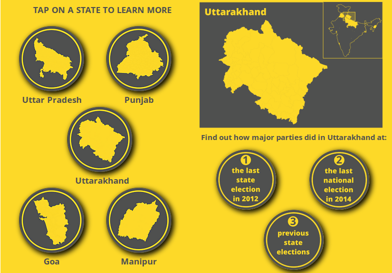
So I created an interactive for Wionews.com (embedded below) on the assembly elections taking place in five states. This write-up goes into how I did the interactive and the motivations behind it.
The Interactive is embedded below. Click on Start to begin.
The interactive looks at three things:
where each party won in the last assembly election in 2012 in each of the five states, visualised with a map.
where each party won in the last Lok Sabha (LS) election in 2014, if the LS seats were broken up into assembly seats. This was also done with a map.
the share of seats won by each major party in previous assembly elections, done with a line chart.
I got all my data from the Election commission website and the Datameet repositories, specifically the repositories with the assembly constituency shapefiles and historical assembly election results.
Now these files have a lot of information in them, but since I was making this interactive specifically for mobile screens and there wouldn’t be much space to play with, I made a decision to focus just on which party won where.
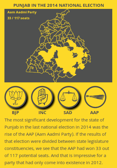
As mundane as that may seem, there’s still some interesting things you get to see. For example, from the break-up of the 2014 Lok Sabha results, you find out where the Aam Aadmi Party has gained influence in Punjab since the last assembly elections in 2012, when they weren’t around.
The interactive page on the AAP in Punjab, 2014
Contents
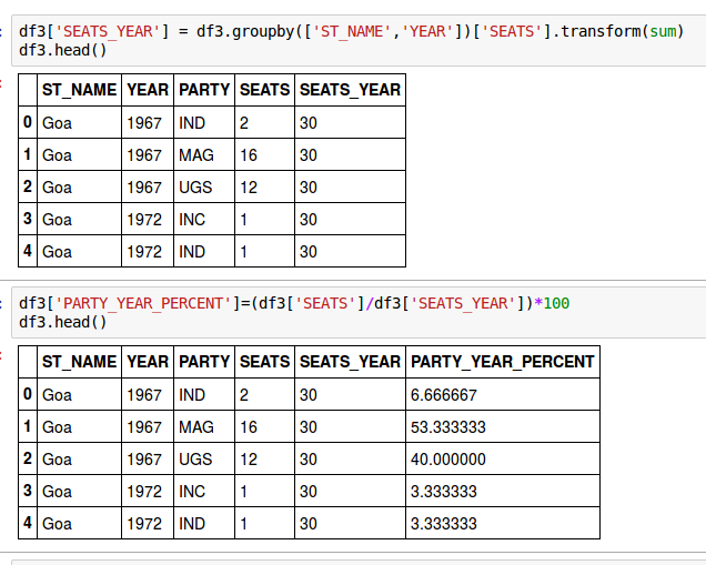
ANALYSING THE DATA
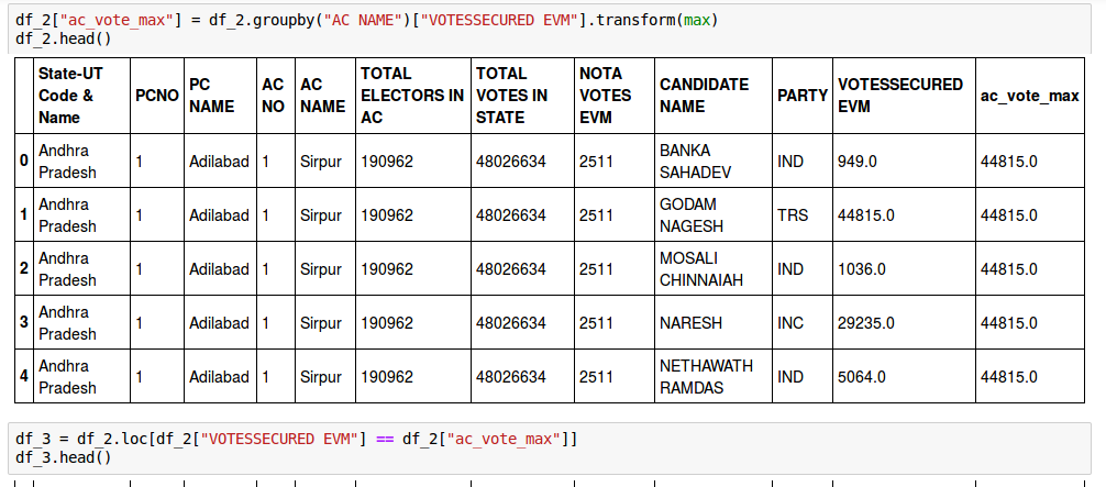
While I got the 2012 election results directly from the election commission’s files, the breakdown of the 2014 Lok Sabha results by assembly seat needed a little more work with some data analysis in python (see code below) and manual cross-checking with other election commission files.
Some of the python code used to break down the 2014 LS results by assembly seat. You can see all of it here.
For calculating the percentages of seats won by major parties in the past, I had to do some analysis in python of Datameet’s assembly election results file.
Some of the python code used to calculate historical seat shares of parties. You can see all of it here.
PUTTING IT ALL ONTO A MAP
The next thing to do was put the data of which party won where onto an assembly seat map for each state.
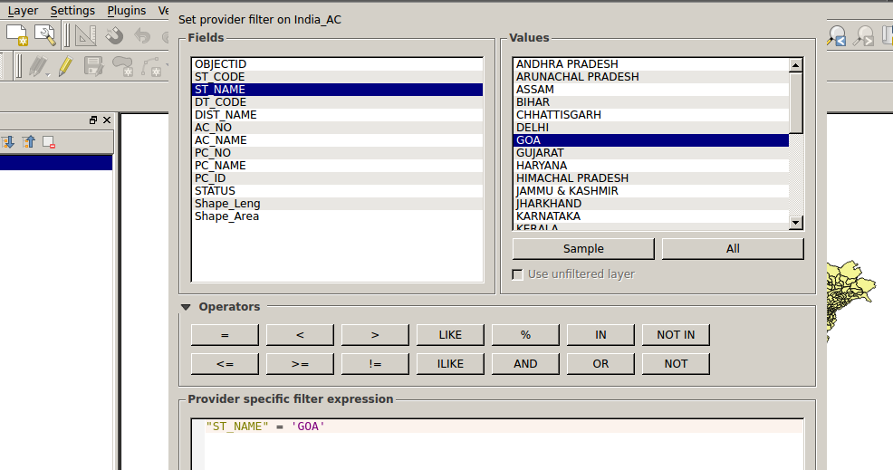
To get the assembly seat maps, I downloaded the assembly constituency shapefile from the datameet repository and used the software QGIS to create five separate shapefiles for each of the states. (Shapefiles are what geographers and cartographers use to make maps.)
A screenshot of the QGIS software separating the India shapefile into separate ones for the states.
The next task is to make sure the assembly constituency names in the shapefiles match the constituency names in the election results. For example, in the shapefile, one constituency in Uttar Pradesh is spelt as Bishwavnathganj while in the election results, it’s spelt as Vishwanathganj. These spellings need to be made consistent for the map to work properly.
I did this with the OpenRefine software which has a lot of inbuilt tools to detect and correct these kinds of inconsistencies.
The purist way would have been to do all this with code, but I’ve been using OpenRefine, a graphical tool, for a while now and it’s just easier for me this way. Please don’t judge me! (Using graphical tools such as OpenRefine and QGIS make it harder for others to reproduce your exact results and is less transparent, which is why purists look down on a workflow that is not entirely in code.)
After the data was cleaned, I merged or ‘joined’ the 2012 and 2014 election results with the shapefile in QGIS, I then converted the shapefile into the geojson format, which is easier to visualise with javascript libraries such as D3.js.
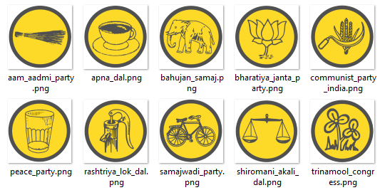
I then chose the biggest three or four political parties in the 2012 assembly and 2014 LS election results for each state, and created icons for them using the tool Inkscape. This can be done by tracing the party symbols available in various election commission documents.
Some of the party icons designed for the interactive
HOW IT’S ALL VISUALISED
The way the interactive would work is if you click on the icon for a party, it downloads the geojson file which, to crudely put it, has the boundaries of the assembly seats and the names of the party that’s won each seat.
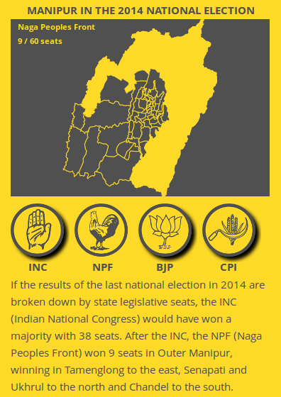
The interactive map showing the NPF in Manipur in 2014
You then get a map with the seats belonging to that party coloured in yellow. And each time you click on a different party icon, a new map is generated. (If I’ve understood the process wrong, do let me know in the comments!)
Here’s some of the d3 code used:
    map2
        .append("svg:image")  //put an image onto the canvas
        .attr("xlink:href","../exp_buttons/bharatiya_janta_party_75.png")  //take the image from the exp_buttons folder
        .attr('height', '75')
        .attr('width', '75')
        .attr('class','shadow partyButton')
        .attr('id','bjpButton')
        .attr("x", 30)
        .attr("y", 0)
        .on("click", function(){
            map
              .append("svg:g")         //create the map
              .style("fill","#4f504f")  //fill the map with this black color
              .selectAll("path")
              .data(json.features)
              .enter()
              .append("path")
                  .attr("d", pathx)
                  .style("stroke", "#fdd928")  //create yellow borders
                  .style("opacity","1")
                  .style("stroke-width", "1")
                  .style("fill",colorParty);      //colorparty is determined by the function below

		 //fill the seats with yellow if they were won by the “Bharatiya Janta Party”
		//and if they were won by someone else, make them black

                function colorParty(d) {
                   if (d.properties.uttarakhand_2012_2012_1 == "Bharatiya Janta Party") {
                      return "#fdd928"
                } else {
                      return "#4f504f";
                    }
                };
              });
I won’t go into the nitty gritty of how the line chart works, but essentially every time you click on one of these icons, it changes the opacity of the line representing the party into 1 making it visible while the opacity of every other line is reduced to 0 making them invisible.
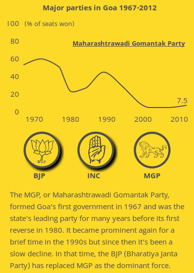
The historical performance of the MGP in Goa.
Here’s some of the relevant d3 code:
svg
	.append("svg:image")                                                             //this tells D3 to put an image onto the canvas
	.attr("xlink:href","../exp_buttons/bharatiya_janta_party_75.png")   //and this will be the bjp image located in the exp_buttons folder
	.attr('height', '75')
	.attr('width', '75')
	.attr('class','shadow partyButton')       //this is what gives a button the shadow, attributes derived from css
	.attr('id','bjpButton')
	.attr("x", 0)
	.attr("y", height + margin.top + 20)
	.on("click", function(){
			d3.selectAll(".line:not(.bjpLine)").style("opacity", "0");  //make all other lines invisible
			d3.selectAll(".bjpLine").style("opacity", "1");                   //make the BJP line visible
			d3.select(this).classed({'shadow': false});		//remove the drop shadow from the BJP button
											//so that people know it’s active
			d3.selectAll('.partyButton:not(#bjpButton)').classed({'shadow': true});  //this puts a drop shadow onto other buttons
													   //in case they were active

			});
I then put everything into a repository on Github and used Github pages to ‘serve’ the interactive to users.
Now I haven’t gone into the complexity of much of what’s been done. For example, if you see those party symbols and the tiny little shadows under them (they’re called drop shadows), it took me at least two days to make that happen.
It took two days to get these drop shadows!
MOTIVATIONS BEHIND THE INTERACTIVE
As for the design, I wanted something that people would just click/swipe through, that they wouldn’t have to scroll through, and also limit the data on display, giving only as much as someone can absorb at a glance.
My larger goal was to try and start doing data journalism that’s friendlier and more approachable than the stuff I’ve been doing in the past such as this blogpost on the Jharkhand elections.
I actually read a lot on user interface design, after which I made sure that the icons people tap on their screen are large enough for their thumbs, that icons were placed in the lower half of the screen so that their thumbs wouldn’t have to travel as much to tap on them, and adopted flat design with just a few drop shadows and not too many what-are-called skeumorphic effects.
Another goal was to allow readers to get to the information they’re most interested in without having to wade through paras of text by just tapping on various options.
The sets of options available to the user while in the interactive
I hacked a lot of D3.js examples on bl.ocks.org and stackoverflow.com to arrive at the final interactive, I’m still some way away from writing d3 code from scratch, but I hope to get there soon.
Because I’m not a designer, web developer, data scientist or a statistician, I may have violated lots of best practices in those fields. So if you happen to come across some noobie mistake, do let me know in the comments, I’m here to learn, thanks! 🙂
Shijith Kunhitty is a data journalist at WION and former deputy editor of IndiaSpend. He is an alumnus of Washington University, St. Louis and Hindu College, Delhi.
One of the longest and most passionately discussed subject on the Data{Meet} list is the availability of Indian Village Boundaries in Digital format. Search for Indian Village shape files and you can spend hours on reading interesting conversations.
A look at the list discussion tells you that boundaries of at the least 75% of the states are available in various formats and quality. What we need at this point is a consolidate effort to bring them all on par in format, attributes and to some level quality. So some volunteers at Data{Meet} agreed to come together, clean up the available maps, add attributes, make them geojson and publish them on our GitHub repository called Indian Village Boundaries.
Of course this will be an on going effort but we would love to reach a baseline (all states) by year end. As of now I have cleaned up and uploaded Gujarat. I have at the least 4 more states to go live by month end. Karnataka, Kerala, Tamil Nadu and Goa. I will announce them on the list as they go live.
The boundaries are organized by state using state ISO code. All the village boundaries are available in geojson (WGS84, EPSG4326) format. The project page gives you the status of the data as we clean and upload. Data is not perfect yet, there could many errors both in data and boundaries. You can contribute by sending the pull requests. Please use the census names when correcting the attributes and geojson for shapes. Please source them to an official source when sending corrections.
Like everything else community creates. All map data will be available under Open Data Commons Open Database License (ODbL). This data is distributed in the hope that it will be useful, but WITHOUT ANY WARRANTY; without even the implied warranty of MERCHANTABILITY or FITNESS FOR A PARTICULAR PURPOSE. If you find issues we are more than happy to accept corrections but please source them to an official source.
On this 70th Independence day, as we celebrate the historic event of India becoming Free and Independent, Data{Meet} community celebrates by cleaning, formatting and digitizing our village boundaries. Have a great time using the maps and contributing back to society.
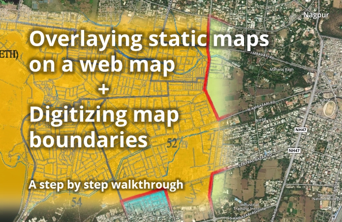
I was recently invited to Nagpur by a group called Center for Peoples Collective, to brainstorm doing for Nagpur the kind of things I’ve done in Pune for budget data processing/viz and mapping. We found that they didn’t have any digital data (ie, shapefile, kml etc) of Nagpur’s electoral wards, but they did have some high-res images released by Nagpur Municipal Corporation (NMC) with the boundaries marked. So I walked them through a process that I’ve worked out, which uses free online services and doesn’t need any software or advanced skills to do. I’m sharing that process here. Continue reading Guide on Digitizing Static Maps→
The Ministry of Home Affairs just released a draft policy on regulating geospatial data. We have several concerns regarding this bill and are drafting a response.
Here’s what you can do to contribute to the conversation.
contribute to the hackpad where we are gathering thoughts.
We have a month to respond. This bill could seriously restrict everyone’s access to mapping data and it even might restrict a individuals ability to keep any mapping data. It is an important conversation we need to have with the government.
On the 2nd of September, 2015, DataMeet-Delhi spun off a small side project known as GeoDel. Following GeoBLR‘s example, GeoDel is a Delhi-based group/community that meets to discuss open spatial data in the Indian context.
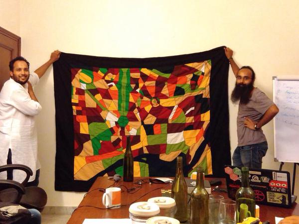
Akvo very kindly hosted us at their beautiful Delhi office, and we began with a very short talk by me (Shashank) on a quilt my mother made, based on OpenStreetMap data of South Delhi. Riju then spoke about mental maps, using a slideshow with some beautiful maps. He ended his talk with a participatory mapping exercise using FieldPaper maps of Delhi, where everyone who attended the meet had a chance to shout out a random place in Delhi, and everyone else had to mark it on their maps. It was a good way to learn about places in Delhi with arcane names such as ‘Rohini‘ and ‘Patparganj‘, and to end our first GeoDel as well.
GeoDel will have bi-monthly meets, so stay updated on its spatio-temporal coordinates via the MeetUp and FaceBook groups!