So I created an interactive for Wionews.com (embedded below) on the assembly elections taking place in five states. This write-up goes into how I did the interactive and the motivations behind it.
The Interactive is embedded below. Click on Start to begin.
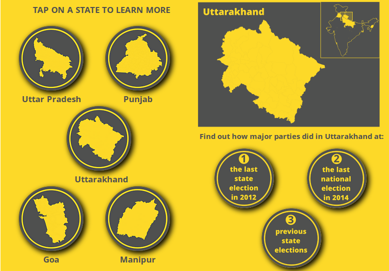
The interactive looks at three things:
- where each party won in the last assembly election in 2012 in each of the five states, visualised with a map.
- where each party won in the last Lok Sabha (LS) election in 2014, if the LS seats were broken up into assembly seats. This was also done with a map.
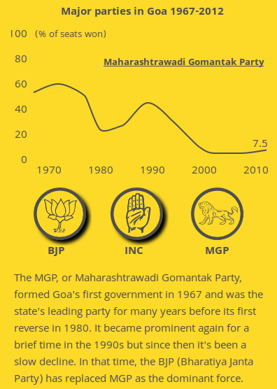
- the share of seats won by each major party in previous assembly elections, done with a line chart.
I got all my data from the Election commission website and the Datameet repositories, specifically the repositories with the assembly constituency shapefiles and historical assembly election results.
Now these files have a lot of information in them, but since I was making this interactive specifically for mobile screens and there wouldn’t be much space to play with, I made a decision to focus just on which party won where.
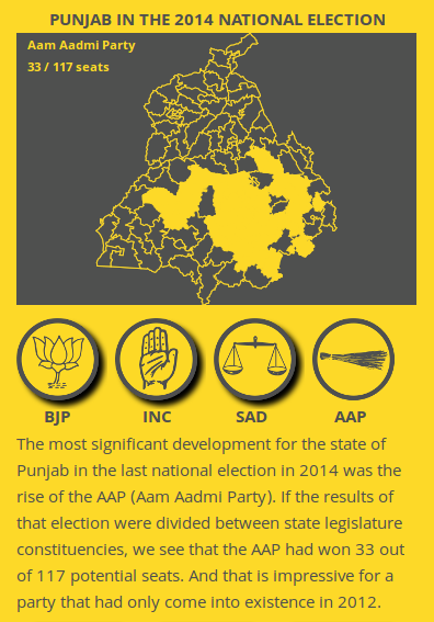
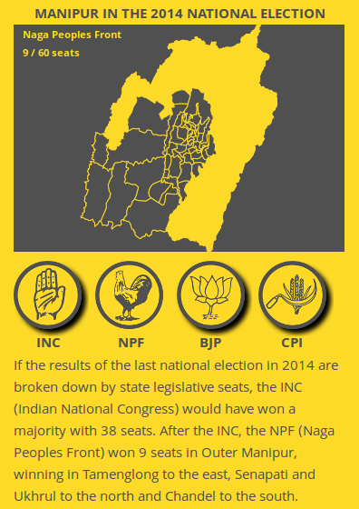
As mundane as that may seem, there’s still some interesting things you get to see. For example, from the break-up of the 2014 Lok Sabha results, you find out where the Aam Aadmi Party has gained influence in Punjab since the last assembly elections in 2012, when they weren’t around.
Contents
ANALYSING THE DATA
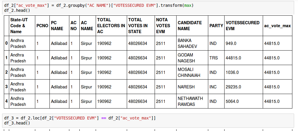
While I got the 2012 election results directly from the election commission’s files, the breakdown of the 2014 Lok Sabha results by assembly seat needed a little more work with some data analysis in python (see code below) and manual cross-checking with other election commission files.
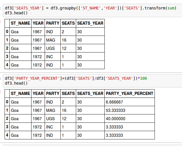
For calculating the percentages of seats won by major parties in the past, I had to do some analysis in python of Datameet’s assembly election results file.
PUTTING IT ALL ONTO A MAP
The next thing to do was put the data of which party won where onto an assembly seat map for each state.
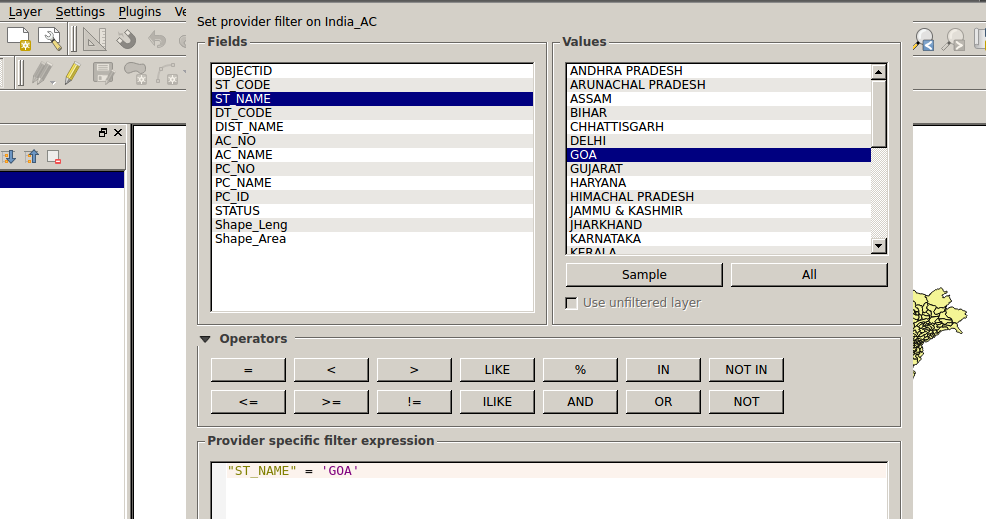
To get the assembly seat maps, I downloaded the assembly constituency shapefile from the datameet repository and used the software QGIS to create five separate shapefiles for each of the states. (Shapefiles are what geographers and cartographers use to make maps.)
The next task is to make sure the assembly constituency names in the shapefiles match the constituency names in the election results. For example, in the shapefile, one constituency in Uttar Pradesh is spelt as Bishwavnathganj while in the election results, it’s spelt as Vishwanathganj. These spellings need to be made consistent for the map to work properly.
I did this with the OpenRefine software which has a lot of inbuilt tools to detect and correct these kinds of inconsistencies.
The purist way would have been to do all this with code, but I’ve been using OpenRefine, a graphical tool, for a while now and it’s just easier for me this way. Please don’t judge me! (Using graphical tools such as OpenRefine and QGIS make it harder for others to reproduce your exact results and is less transparent, which is why purists look down on a workflow that is not entirely in code.)
After the data was cleaned, I merged or ‘joined’ the 2012 and 2014 election results with the shapefile in QGIS, I then converted the shapefile into the geojson format, which is easier to visualise with javascript libraries such as D3.js.
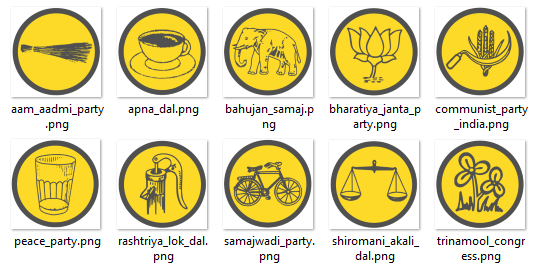
I then chose the biggest three or four political parties in the 2012 assembly and 2014 LS election results for each state, and created icons for them using the tool Inkscape. This can be done by tracing the party symbols available in various election commission documents.
HOW IT’S ALL VISUALISED
The way the interactive would work is if you click on the icon for a party, it downloads the geojson file which, to crudely put it, has the boundaries of the assembly seats and the names of the party that’s won each seat.
You then get a map with the seats belonging to that party coloured in yellow. And each time you click on a different party icon, a new map is generated. (If I’ve understood the process wrong, do let me know in the comments!)
Here’s some of the d3 code used:
    map2
        .append("svg:image")  //put an image onto the canvas
        .attr("xlink:href","../exp_buttons/bharatiya_janta_party_75.png")  //take the image from the exp_buttons folder
        .attr('height', '75')
        .attr('width', '75')
        .attr('class','shadow partyButton')
        .attr('id','bjpButton')
        .attr("x", 30)
        .attr("y", 0)
        .on("click", function(){
            map
              .append("svg:g")         //create the map
              .style("fill","#4f504f")  //fill the map with this black color
              .selectAll("path")
              .data(json.features)
              .enter()
              .append("path")
                  .attr("d", pathx)
                  .style("stroke", "#fdd928")  //create yellow borders
                  .style("opacity","1")
                  .style("stroke-width", "1")
                  .style("fill",colorParty);      //colorparty is determined by the function below

		 //fill the seats with yellow if they were won by the “Bharatiya Janta Party”
		//and if they were won by someone else, make them black

                function colorParty(d) {
                   if (d.properties.uttarakhand_2012_2012_1 == "Bharatiya Janta Party") {
                      return "#fdd928"
                } else {
                      return "#4f504f";
                    }
                };
              });
I won’t go into the nitty gritty of how the line chart works, but essentially every time you click on one of these icons, it changes the opacity of the line representing the party into 1 making it visible while the opacity of every other line is reduced to 0 making them invisible.
Here’s some of the relevant d3 code:
svg
	.append("svg:image")                                                             //this tells D3 to put an image onto the canvas
	.attr("xlink:href","../exp_buttons/bharatiya_janta_party_75.png")   //and this will be the bjp image located in the exp_buttons folder
	.attr('height', '75')
	.attr('width', '75')
	.attr('class','shadow partyButton')       //this is what gives a button the shadow, attributes derived from css
	.attr('id','bjpButton')
	.attr("x", 0)
	.attr("y", height + margin.top + 20)
	.on("click", function(){
			d3.selectAll(".line:not(.bjpLine)").style("opacity", "0");  //make all other lines invisible
			d3.selectAll(".bjpLine").style("opacity", "1");                   //make the BJP line visible
			d3.select(this).classed({'shadow': false});		//remove the drop shadow from the BJP button
											//so that people know it’s active
			d3.selectAll('.partyButton:not(#bjpButton)').classed({'shadow': true});  //this puts a drop shadow onto other buttons
													   //in case they were active

			});
I then put everything into a repository on Github and used Github pages to ‘serve’ the interactive to users.
Now I haven’t gone into the complexity of much of what’s been done. For example, if you see those party symbols and the tiny little shadows under them (they’re called drop shadows), it took me at least two days to make that happen.
MOTIVATIONS BEHIND THE INTERACTIVE
As for the design, I wanted something that people would just click/swipe through, that they wouldn’t have to scroll through, and also limit the data on display, giving only as much as someone can absorb at a glance.
My larger goal was to try and start doing data journalism that’s friendlier and more approachable than the stuff I’ve been doing in the past such as this blogpost on the Jharkhand elections.
I actually read a lot on user interface design, after which I made sure that the icons people tap on their screen are large enough for their thumbs, that icons were placed in the lower half of the screen so that their thumbs wouldn’t have to travel as much to tap on them, and adopted flat design with just a few drop shadows and not too many what-are-called skeumorphic effects.
Another goal was to allow readers to get to the information they’re most interested in without having to wade through paras of text by just tapping on various options.
I hacked a lot of D3.js examples on bl.ocks.org and stackoverflow.com to arrive at the final interactive, I’m still some way away from writing d3 code from scratch, but I hope to get there soon.
Because I’m not a designer, web developer, data scientist or a statistician, I may have violated lots of best practices in those fields. So if you happen to come across some noobie mistake, do let me know in the comments, I’m here to learn, thanks! 🙂
Shijith Kunhitty is a data journalist at WION and former deputy editor of IndiaSpend. He is an alumnus of Washington University, St. Louis and Hindu College, Delhi.