Tag Archives: water

Global Open Data Index: Water Quality

Last year I helped assess the water quality section of the Global Open Data Index (GODI). Given the news of lead poisoning in Flint, Michigan and increasingly beyond, safe drinking water is no longer assured even in countries where it’s been guaranteed, so I am very glad they included it in GODI.

GODI is a survey of 122* countries that look at the status of ‘high priority datasets’ and whether they are truly open according to the Open Data Criteria. Water quality was included last year for the first time. So my job was to examine each country’s submission  and assess if the data submitted was what was asked for and met the criteria for being open. This was a daunting task but I figured if I could find water quality data in India of all places it wouldn’t be impossible.

Assessment Criteria/Methodology

GODI looked for very specific parameters:

While there are a lot more parameters that could be asked for, these were a good sample of parameters to assess if there is robust water monitoring in the country.

After the initial submission phase there were a lot questions about why wouldn’t the survey just ask for drinking water quality data or environmental monitoring data?

Choosing parameters instead of programmes is important because monitoring the environment and drinking water quality are connected. Some countries haven’t really established large nationalized water treatment strategies, drinking water comes directly from a natural resource so the environmental monitoring data inadvertently applies to the drinking water scenario.  Which means that if a country really has robust water quality data they must have these 5 parameters because they cover surface and ground water sources and also reflect safe drinking water standards.

The assessment would be rejected if a submitter only found the surface water body monitoring stations (environmental water monitoring) for instance because arsenic and fluoride are only found in groundwater. So the submitter would either ideally find the treated drinking water quality data which will cover all the parameters or the source water quality data for both surface and ground water.

For a full look at the methodology of the entire survey go here.

Some background

There is no one way to create water management systems but there are two major ways by which people get water – directly from the source or piped in from a source or a treatment facility. The origins of the water source is important. If you are getting water from the ground there are different quality issues  than from surface water (lake or river). If water is from a treatment plant there is a possibility that plant is getting water from both surface water, ground water, and in some cases recycled water. Usually water quality is measured at source and after treatment (treatment plants take multiple water quality samples during the treatment process.)

A full water quality assessment means lots of parameters and not all of them are tested the same way; some parameters take several days and require specific conditions, others can be taken easily through filters or litmus papers.  Water quality is a deliberate process of sampling and testing, and it not as easy as sticking a sensor into the water and monitor a continuous feed of data (although the potential for these approaches is quickly growing as technology improves.)

What I looked for

Since water quality was a scientific process I figured if I found any proof of water treatment or quality monitoring, a dataset would not be far off. After going through a few countries I noticed that the different water management approaches and policies affected where you would find the data.

Most countries give drinking water treatment responsibilities to local bodies but sometimes is monitored by central government under public health regulation so aggregated data could lie with the public health ministry or the environmental protection body.  In most cases responsibility for environmental monitoring fell to a central government Environmental Ministry.

So this scenario means that multiple datasets exist – a centralized dataset for surface and groundwater that  usually lies with the environmental ministry that could have all the parameters but sometimes doesn’t, or it doesn’t have real time data (this means data  may be available but from less frequent data collection such as quarterly or half yearly efforts). Or the Public Health Ministry has reports of water quality with all the parameters but these are aggregated, and usually in a report form (not a dataset) and not updated in a timely manner.

The US, for instance, falls under this group and can produce confusing submissions. The US has a robust geological survey of surface and ground water sources. However, the drinking water reports are supposed to go to the Environmental Protection Agency but no one seems to be updating the database with information. In my assessment I reduced the score because both are supposed to be available in the public domain.

There are countries like Belgium where water management and monitoring are completely left to the local body and there is no central role for monitoring at all, which meant there is no dataset.

There are countries where there is a strong central role in water management and a dataset could be made open like in France. Korea stood out, because they have live real time water quality information from their treatment plants that gets updated to a website.

Then there are the ‘unsures’: which are countries that seem to treat water to some degree or have national drinking water monitoring programmes but don’t have data online, reports or any mention of data at all. This is not restricted to the developing world. I was very frustrated with several European countries with newspaper articles riddled with reports of how pristine and delicious their water is that don’t have a single public facing dataset.

Take Aways

United Kingdom and the US, both pioneers of the open data movement had terrible water quality data for water treatment, and no effort has been made to bring the data together or make it available in a real time fashion.  Also it is not clear to citizens who holds local bodies accountable for not updating their reports, making reports public or finding ways to bring this data into the light so it can be usable. It is no wonder that the US is now on the cusp of a public health crisis.

It is frustrating that the open data movement hasn’t quite been able to reconcile decentralization and local responsibility with national level accountability and transparency. Public health is a national level issue even though local and regional contexts are required for management. How do we push for openness and transparency in systems like this?

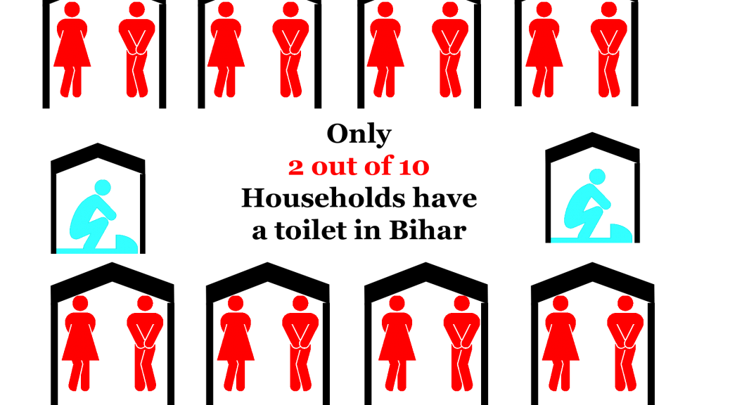
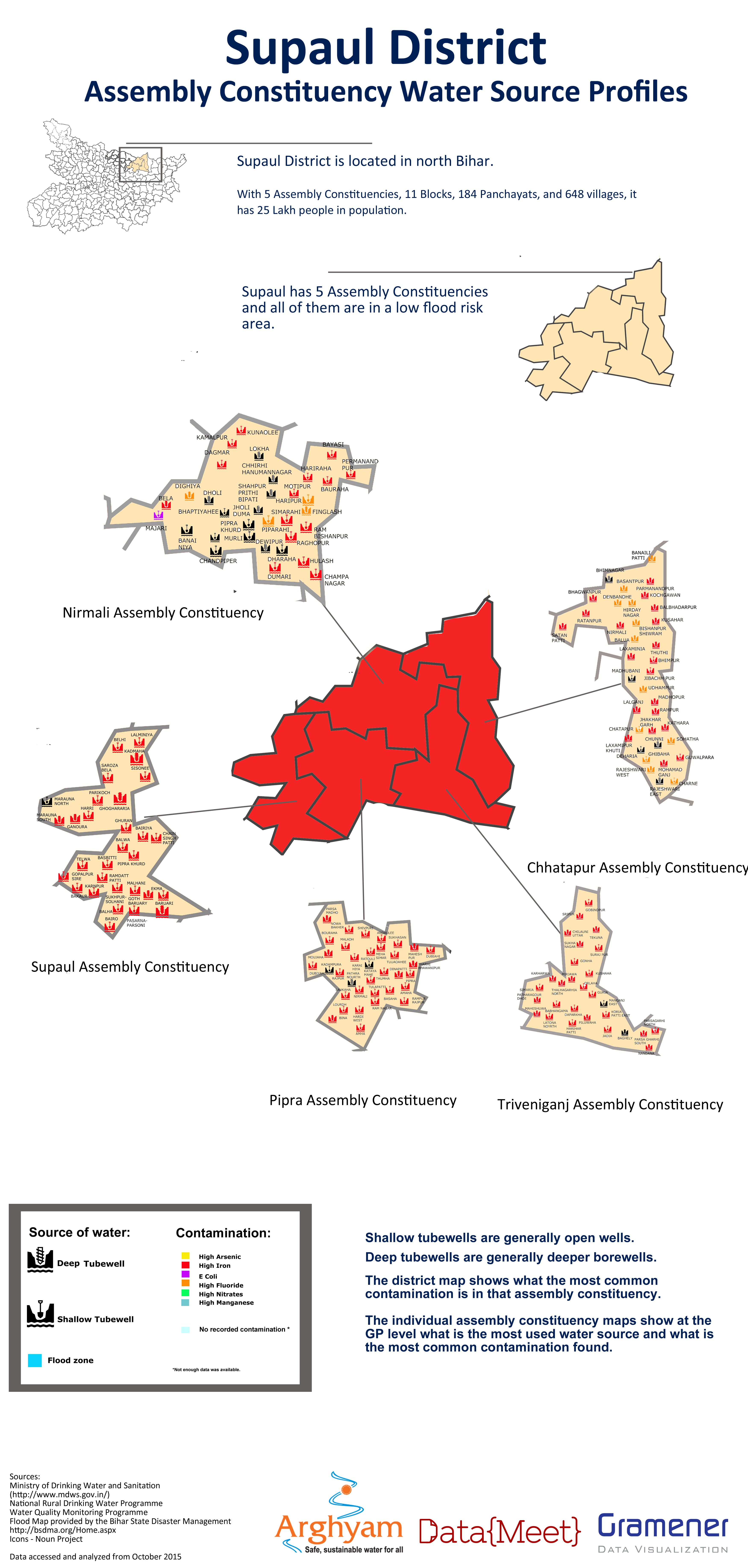
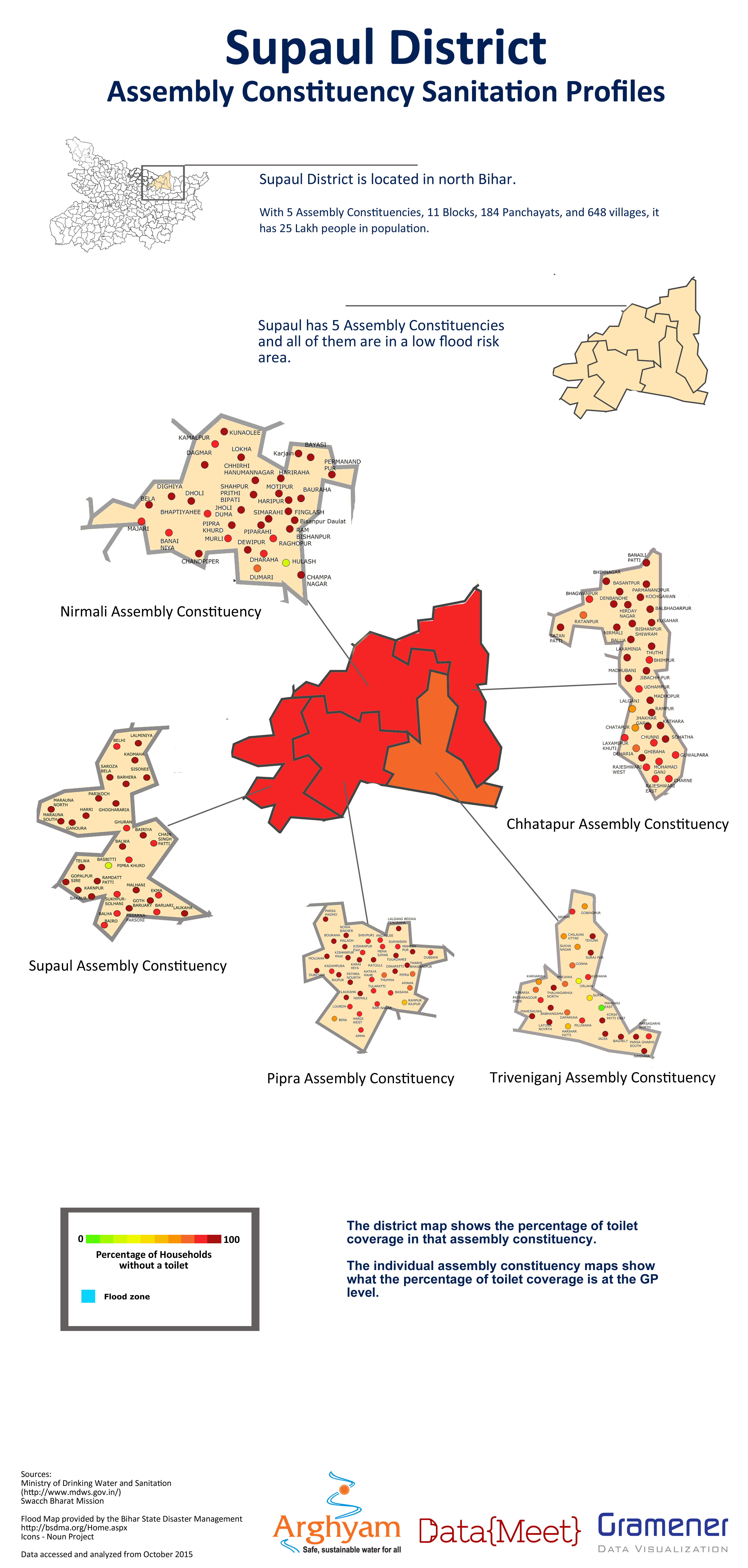
In places like India where water quality treatment is largely left to private players and huge populations are not receiving treated water, the need for data to be available, open, and in the hands of central bodies but also local players is a must, because people need to try to find solutions and where to intervene. Given the huge problems with water borne diseases, the slow but epic arsenic and fluoride poisonings gripping parts of India, and the effects this will have for generations, making this data public, usable and demystified is no longer an option.

All in all, I have to say this was an enlightening experience, it was cool to be able to learn something about each country. In our continuous push for open data we sometimes get lost in standards, formats, and machine readability, but taking a moment to really prioritize our values in society and have open data reflect that is essential. Public health outcomes and engaging with complex issues like it are an essential part of how to grow the open data movement and make it relevant to millions more.

*(Correction: Previous version said the survey included 148 countries, the actual number is 122.)

Bihar Elections

DataMeet has always been interested in doing projects so last year we decided to run a pilot. In the last few years the demand for data work has increased from non profits and journalists and they usually approach data analytics vendors like Gramener. However, these firms can be expensive or have high paying clientele which means that smaller accounts tend to not get their full attention. This leads to an increase in volunteer events like hackathons which don’t always result in finished usable products or can give non profits the long term engagement they need to solve issues. Vendors are not usually privy to the specific data problems a sector has and don’t want to let their tech people invest the time to learn about the subject and understand the particular data challenges. Though the civic tech space is growing, non profits and media houses can’t yet afford or see the need for internal tech teams to deal with their data workload.

With all this in mind we wanted to see if DataMeet can help fill and enrich this space as well as help build capacity within non profits to manage data projects. We were trying to find out, can we assemble teams through the DataMeet network to manage the entire pipeline of data work from clean up to visualization. These wouldn’t be permanent teams but filled with freelancers or hobbyists.

For this first project DataMeet would project manage and Gramener would provde the data analysts, the non profit managing partner was Arghyam and the ground partner was Megh Pyne Abhiyan. Megh Pyne Abhiyan works in several districts in north Bihar on water and sanitation issues. They wanted to use data to tell the story of what the status of water and sanitation was in those districts as a way of engaging with people during the election. It was decided we would do water and sanitation (WATSAN) status report cards for 5 districts — Khagaria, Pashchim Champaran, Madhubani, Saharasa, and Supaul — using government data.

This was an exciting project for us because it would be the first time DataMeet would work with a partner who works on the ground and the output would be for a rural, non online, non-English speaking audience.

DataMeet would project manage the process of data cleanup, analysis and visualization (which the team from Gramener would do) and then give the report cards to the Megh Pyne Abhiyan for them to do the translation and create the final representation of the report cards for their audience.

The Data

The partner wanted the data to be mapped to Assembly Constituencies, they wanted analysis for following situations

  1. Sanitation coverage for each Assembly Constituency and Gram Panchayat.
  2. Water quality, what is the contamination situation of the district, Assembly Constituency and Gram Panchayat.
  3. Water access, how do people get their drinking water.

It was also important to understand this data in the context of the flood prone areas of Bihar. For instance if there is an area that gets drinking water from shallow wells, with little sanitation in a high flood area those areas can suffer from high levels of water borne diseases.

The data we got was from

Since we were doing report cards based on Assembly Constituencies we needed the data to be at the Gram Panchayat (GP) level. Luckily the MDWS does a good job of collecting data all the way down to habitation so GP level data was available.

There is no official listing of what GPs are in which Assembly Constituency so the partner was asked to split the data by AC so we wouldn’t have to do that mapping. They agreed they knew the area better and would have the resources to pull together all the GP level data into organized Dropbox folders grouped by districts then split into ACs.

Data Cleanup

We received one PDF file per GP,  for water access and number of toilets, water quality was given in one large file by district.

All the data we received was in PDF. This was a huge hurdle as the data was from the government information management system so it was from a digital format but rendered in a PDF this meant that we had to convert unnecessarily. However, since the ground partner picked the data they needed and organized it by AC we wanted to make sure we were using the data they specified as important. So we decided to convert the data. This job was done by Thej and I and was extremely manual and time consuming and caused some delay in the data being sent to the analysts.  (See how we did it here.)

Analysis

The analysis required was basic. They needed to know at an AC level what the sanitation coverage was, the sources of water, how people were accessing it and what the water quality situation is.  Rankings compared to other districts and ACs were done to give context. Rankings compared to other districts and ACs were done to give context.So in all the analysis stage didn’t take much time.

Example of Analysis


Visualization

The UNDP along with the Bihar State Disaster Management Authority had created a map of diaster prone areas including flood. It was in PDF so we asked the folks at Mapbox India to help out with creating a shapefile for the flood map so we layer flood areas onto the Assembly Constituencies.

Bihar AC map with flood prone areas


While we had AC maps we didn’t have GP level maps. They didn’t seem to be available and we couldn’t find them in PDF form either.

Since the election is staggered by district we started with Khagaria. After the initial report cards were done the partner wanted just the cleaned up data in tables to use for their meetings. So we then decided to do the report cards, clean up the data and send the spreadsheets over to them.

As we were processing the next 4 districts I found GP level maps of Bihar, with boundaries of ACs included. This was quite exciting and I thought since we had some time we could do maps for the four pending districts.

After receiving the analysis for the next district I decided that since it would take to long to trace the PDF maps, so the analysts could map the GPs, I would just over lay them onto our AC shapefiles in Photoshop. I was going to put icons or circles in the center of the GP and that would be the map. While tedious I figured it would be worth it to show the maps to the ground partner.

However, when I started mapping I realized that analyzed data wasn’t matching up with the GPs on the map. The GPs listed in the Assembly Constituency in our original folders were incorrect, which meant all the analysis was wrong. Everything had to be checked against the maps and reorganized in the final datasets and then reanalyzed. This caused a huge delay.

On top of that the GPs on the map were spelled differently than in the MDWS data, and every dataset potentially had a different spelling of a particular GP. Which meant the remapping of the data had to be done manually looking at the map, the data, other sources, and sometimes guessing if this was the correct GP or not. This ended up being a manual process for every AC, as we didn’t do this mapping and standardization in the beginning.

While the delay caused problems with the maps being used in the election, they were worth doing to understand the problems with the data and the ground partner identified with the maps the most. By the end we were able to produced districts posters for the different parameters.

Sample report card


Final Posters

PC_sanitation copy poster madhubani_wateraccess copy poster madhubani_sourceprofileposters madhubani_sanitation poster Supaul_wateraccess copy poster copy Supaul_sourceprofile poster copy Supaul_sanitation copy poster copy Saharsa_wateraccess copy poster copy Saharsa_sourceprofile poster copy Saharsa_sanitation copy poster copy PC_wateraccess copy poster PC_sourceprofile poster


Lessons for next time

We learned a lot from this process. Mainly that the issues with standardization of Indian names in data is a real concern. While initiatives like Data.Gov.In are an important first step, it will take real will and dedication to work out this problem.

NGOs and groups that don’t work with data at the scale of modern data techniques are not always familiar with issues like formats, standardization problems, data interoperability,visualization and mapping to other datasets. This means that more time needs to be spent getting the intentions of the project out of the partner not just outputs. Problems like PDFs are not things everyone thinks about so the extra time of working with the partner to understand what data they want and find way to get it are better spent then converting PDFs to CSV if we don’t have to.

Designers are important, I created and designed the maps and posters, while I’m proud of them, they could have been done better and faster by a trained designer. Designers are worth the money and effort in order to make the final product really reflect the care and work we put into the data.

I consider this experience a success, despite the setbacks, we learned how to manage a team that was not full time and how important the initial work with the ground partners are to create realistic deliverables and timelines.

You can get all the data on DataMeet’s github page. 

Big thanks to the Gramener team – Santhosh, Pratap and Girish for dedicating their free time to this.

Data On the Ground: Crosspost from India Water Portal

From India Water Portal.  Communities using planning, data and collaboration to take control of their water security.  

Excerpt

What stands out in Dholavira, is the attention to detail when it came to collecting and storing water. More than 16 reservoirs are said to exist on this 100 hectare site, of which 5 have been excavated. While these reservoirs harvested rainwater, an elaborate system of drainage channels was planned to ensure that all the runoff collected in these tanks. “See this reservoir,” Raujibhai says, “it has a well inside it so that even if the tank dries up, the well will supply water”. There is also a standalone well and a seasonal stream, which was dammed at multiple points to harvest water.

Their water mantra was simple: collect and store water locally and conserve it to provide fresh water. This continues to be relevant even today for the 1.7 lakh people who live in Rapar, the taluka where Dholavira is located.

Rainfall map of India. Historically, Rapar has received poor rainfall. (Source: IWP)

Rainfall map of India. Historically, Rapar has received poor rainfall. (Source: IWP)

This has been proven by Samerth, an organisation that has worked with communities in 20 Gram Panchayats in Rapar to create structures that can store 64 million cubic feet of water. What are the elements that are common? How is Rapar’s water security now?


Read the rest of this amazing story here.

Crosspost: Adding stress to a stressed area!

A few weeks ago we held an Intro to Data Journalism Workshop.  Josephine Joseph was in attendance, she regularly writes for Citizen Matters, Bangalore’s local paper that knows all.  She was working on this story and has published it last week with Citizen Matters, I’m very happy to crosspost it here as a great example of local data journalism.  

26 projects could: add 19,000 cars to Whitefield traffic, up water demand by 10.5 million litres

East Bangalore area, particularly Whitefield- KR Puram – Mahadevapura area, is on the prime real estate map. What are the projects coming up next? What are the implications?

Investing in real estate in Bangalore is a dream of any investor. However, is the growth of this sector in tune with the infrastructure that the city can handle?

A close look by Citizen Matters at 26 constructions coming up in Whitefield – KR Puram area in East Bengaluru shows some alarming observations. When the 8,000 flats are fully occupied, new residents will need 10,662.87 KL of water a day (equivalent of 1780 water tankers of 6000 Litres). More than 19,697 cars will add to Whitefield traffic.

Ministry of Environment and Forests (MoEF) rules make builders of projects of more than 20,000 sqm built up area, apply for an Environmental Clearance (EC) from the state, along with all the other permissions and NOC from BBMP, BWSSB, Karnataka Ground Water Authority (KGWA) to drill borewells prior to construction commencement.

The State Expert Appraisal Committee (SEAC) receives the applications and recommends checks and balances, prior to recommending a project for EC to the State Environment Impact Assessment Authority (SEIAA).

The SEIAA reviews project details, clarifies issues and only then is the EC issued. In cases where construction has begun without an EC, the builder is served with a show cause notice. The KSPCB can file cases against builders under the Environment Protection Act if they proceed with construction without an EC.

Read the rest over at Citizen Matters. 

Great work Josephine!