Category Archives: Data

Nepal Needs You to Make Maps!

Post by Tejas AP

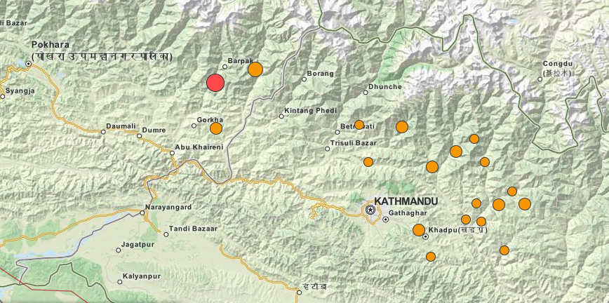
The Humanitarian OpenStreetMap Team (HOTOSM) has activated to support crisis response in Nepal after the recent devastating earthquake. A global team of volunteers is contributing to the OSM project by mapping physical infrastructure (roads and buildings) as well as traces and areas safe for crisis responders to use and congregate at. We believe improved information, especially of the remote affected areas, is crucial to improve the efforts carried out by relief agencies on-ground.

Volunteers may contribute to the map of Nepal simply by selecting a task from the wiki. Basic questions about registering and using the OSM mapping tool can be found in its comprehensive documentation here.

While the volunteers have been recording road networks and buildings at a rapid pace, we understand that the communication networks in Nepal are still being restored, and crisis responders might not have access to navigation maps to expedite their efforts. We want to help in ensuring that people have access to map data in every manner possible.

We want to print offline maps and send them with relief materials from India to Nepal. Please help us by providing us

* a list of towns/villages/regions you need maps of, and

* point-of-contact we can deliver the printed maps to.

For more information, please get in touch with

Sajjad  – sajjad(at)mapbox(dot)com

Tejas  – tejaspande(at)live(dot)com

Nisha  – nisha(at)datameet(dot)com

Prabhas – prabhas.pokharel(at)gmail(dot)com

Meanwhile, here’s some information that you might find useful  –

1. https://www.mapbox.com/blog/nepal-earthquake/
2. The News Minute report –
http://www.thenewsminute.com/article/how-group-individuals-all-over-india-are-making-maps-help-rescue-teams-nepal
3. HOT Wiki – https://wiki.openstreetmap.org/wiki/2015_Nepal_earthquake
4. KLL report – http://kathmandulivinglabs.org/blog/

Open Transit Data for India

(Suvajit is a member of DataMeet’s Transportation working group, along with Srinivas Kodali, we are working on how to make more transit related data available.)

Mobility is one of the fundamental needs of humanity. And mobility with a shared mode of transport is undoubtedly the best from all quarters – socially, economically & environmentally. The key to effective shared mode of transport (termed as Public Transport) is “Information”. In India cities, lack of information has been cited as the primary reason for deterrence of Public Transport.

Transport Agencies are commissioning Intelligent Transport Systems (ITS) in various mode and capacity to make their system better and to meet the new transport challenges. Vehicle Tracking System, Electronic Ticketing Machines, Planning & Scheduling software are all engines of data creation. On the other side, advent of smart mobile devices in everyone’s hand is bringing in new opportunities to make people much more information reliant.

But the demand for transit data is remarkably low. The transit user and even transit data users like City Planners should demand for it.
The demand for Public Transport data in India should be for the following aspects:

A. Availability
To make operation and infrastructure data of Transport operators easily available as information to passengers in well defined order to plan their trip using available modes of Public Transport.

B. Interoperability
To make transit data provided by multiple agencies for different modes (bus, metro, rail) usable and make multi modal trip planning possible.

C. Usability
To publish transit oriented data in standard exchange format across agencies in regular frequencies to provide comprehensive, accurate and updated data for study, research, analysis, planning and system development.

D. Standardisation
To be a part of Passenger charter of Transport Operators to publish their data in standard format and frequency. This can also serve as a guideline for Transporter Operator while commissioning any system like Vehicle Tracking System, ITS, Passenger Information System, website etc.

What kind of Transit data is needed ?

  • Service Planning data

It will comprise of data on bus stops, stations, routes, geographic alignment, timetables, fare charts. With this dataset, general information on transit service can be easily gathered to plan a journey. Trip Planning mobile apps, portals etc can consume this data to provide ready and usable information for commuters.

  • Real time data

A commuter is driven by lot of anxieties when they depend on public transport mode. Some common queries; “When will the bus arrive ?”, “Where is my bus now?”, “Will I get a seat in the bus ?”, “Hope the bus has not deviated and not taking my bus stop.”.

Answer to all this queries can be attended via real time data like Estimated Time of Arrival (ETA), Position of the vehicle, Occupancy level , Alert and Diversion messages etc. Transport Operator equipped with Tracking systems should be able to provide these data.

  • Operational & Statistical Data

A Transport Operators operational data comprises of ticket sales, data of operation infrastructure and resources like Depots, Buses, Crew, Workshops etc. As operatore are tending towards digital mode of managing these data it also makes a good option to publish them at regular intervals.

A general commuter might not be interested in this data, but it will very useful for City Planners to analyse the trend of commute in the city and make informed decision. City transport infrastructure can be planned to orient it towards transit needs and demands.

The transport agency can benefit highly by demonstrating accountability and transparency. They can uplift their image as a committed service provider thereby gaining for passengers for their service.

So, together it will make a thriving landscape, if the data creators of Public Transport in India provide their data in Open which can be consumed by a larger set of people to build platforms, applications, solutions for transport study, analysis & planning across different section of users.

Open Transit Data is the tipping point for Smart Mobility in India.

That is why we have started putting our thoughts together and began writing an Open Transport Data Mainfesto.
Data On the Ground: Crosspost from India Water Portal

From India Water Portal.  Communities using planning, data and collaboration to take control of their water security.  

Excerpt

What stands out in Dholavira, is the attention to detail when it came to collecting and storing water. More than 16 reservoirs are said to exist on this 100 hectare site, of which 5 have been excavated. While these reservoirs harvested rainwater, an elaborate system of drainage channels was planned to ensure that all the runoff collected in these tanks. “See this reservoir,” Raujibhai says, “it has a well inside it so that even if the tank dries up, the well will supply water”. There is also a standalone well and a seasonal stream, which was dammed at multiple points to harvest water.

Their water mantra was simple: collect and store water locally and conserve it to provide fresh water. This continues to be relevant even today for the 1.7 lakh people who live in Rapar, the taluka where Dholavira is located.

Rainfall map of India. Historically, Rapar has received poor rainfall. (Source: IWP)

Rainfall map of India. Historically, Rapar has received poor rainfall. (Source: IWP)

This has been proven by Samerth, an organisation that has worked with communities in 20 Gram Panchayats in Rapar to create structures that can store 64 million cubic feet of water. What are the elements that are common? How is Rapar’s water security now?


Read the rest of this amazing story here.

Rebuilding the Karnataka Learning Partnership Platform

The Karnataka Learning Partnership recently launched a new version of their platform. This post talks about why they are building this and also some of the features and details. This is cross-posted from their blog.

Over the past five months we have been busy rearchitecting our infrastructure at Karnataka Learning Partnership. Today, we are launching the beta version of the website and the API that powers most of it. There are still a few rough edges and incomplete features, but we think it is important to release early and get your feedback. We wanted to write this blog post along with the release to give you an overview of what has changed and some of the details of why we think this is a better way of doing it.

Data

We have a semi-federated database architecture. There is data from Akshara, Akshaya Patra, DISE and other partners; geographic data, aggregations and meta-data to help make sense of a lot of this. From our experience PostgreSQL is perhaps the most versatile open-source database management system out there, Especially when we have large amounts of geographic data. As part of this rewrite, we upgraded to PostgreSQL 9.3, which means better performance and new features.

Writing a web application which reads from multiple databases can be a difficult task. The trick is make sure that there is the right amount of cohesiveness. We are using Materialized Views in PostgreSQL. Materialized View is a database object that stores the result of a query in a on-disk table structure. They can be indexed separately and offer higher performance and flexibility compared to ordinary database views. We bring the data in multiple databases together using Materialized Views and refreshing them periodically.

We have a few new datasets – MP/MLA geographic boundaries, PIN code boundaries and aggregations of various parameters for schools.

API

The majority of efforts during the rewrite went into making the API, user interface and experience. We started by writing down some background. The exhaustive list of things that the API can do are here.

We have a fairly strong Python background and it has proven to be sustainable at many levels. Considering the skill-sets of our team and our preference for readable, maintainable code, Django was an obvious choice as our back-end framework. Django is a popular web development framework for Python.

Since we were building a fairly extensive API including user authentication, etc., we quickly realized that it would be useful to use one of the many API frameworks built on top of Django. After some experimentation with a few different frameworks, we settled on using Django-Rest-Framework. Our aim was to build on a clean, RESTful API design, and the paradigms offered by Rest-Framework suited that perfectly. There was a bit of a learning curve to get used to concepts like Serializers, API Views, etc. that Rest-Framework provides, but we feel it has allowed us to accomplish a lot of complex behaviours while maintaining a clean, modular, readable code-base.

Design

For our front-end, we were working with the awesome folks at Uncommon, who provided us gorgeous templates to work with. After lengthy discussions and evaluating various front-end frameworks, we felt none of them quite suited what we were doing, and involved too much overhead. Most front-end frameworks are geared toward making Single Page Apps and while each of our individual pages have a fair amount of complexity, we did not want to convert everything into a giant single page app, as our experience has shown that can quickly lead to spiraling complexity, regardless of the frame-work one uses.

We decided to keep things simple and use basic modular Javascript concepts and techniques to provide a wrapper around the templates that Uncommon had provided and talk to our API to get and post data. This worked out pretty well, allowing us to keep various modules separated, re-use code provided by the design team as much as possible, and not have to spend additional hours and days fighting to fit our code into the conventions of a framework.
All code, design and architecture decisions are in the open, much like how rest of our organisation works. You can see the code and the activity log in our Github account.

Features

For the most part, this beta release attempts to duplicate what we had in v10.0 of the KLP website. However, there are a few new features and few features that have not yet made it through and a number of features and improvements due in future revisions.

Aside from the API, there are a few important new features worth exploring:

  1. The compare feature available at the school and pre-school level. This allows you to compare any two schools or pre-schools.

    1. Planned Improvements: The ability to compare at all and any levels of hierarchy; a block to a block or even a block to a district etc.

  2. The volunteer feature allows partner organisations to post volunteer opportunities and events at schools and pre-schools. It also allows users to sign up for such events.

    1. Planned Improvements: Richer volunteer and organisation profiles and social sharing options.

  3. The search box on the map now searches through school names, hierarchy (district, block etc.) names, elected representative constituency names and PIN Codes.

    1. Planned Improvements: To add neighbourhood and name based location search.

  4. An all new map page powered by our own tile server.

  5. Our raw data page is now powered by APIs and the data is always current unlike our previous version which had static CSV files.

    1. Planned Improvements: To add timestamps to the files and to provide more data sources for download.

Now that we have a fairly stable new code base for the KLP website, there are a few features from the old site that we still need to add:

  1. Assessment data and visualisations of class, school and hierarchy performance in learning assessments needs to be added. The reason we have chosen not to add it just yet is because we are modifying our assessment analysis and visualisation methodology to be simpler to understand.

  2. Detail pages for higher levels of aggregation – like a cluster, block and district with information aggregated to that level.

  3. A refresh of the KLP database to bring it up to date with the current academic year. All these three have not been done for the same reason; because this requires an exhaustive refactor of the existing database to support the new assessment schemas and aggregation and comparison logic.


Aside from the three above, we have a few more features that have been designed and written but did not make it in to the current release.

  1. Like the volunteer workflow, we have a donation workflow that allows partner organisations to post donation requirements on behalf of the schools and pre-schools they work with for things these schools and pre-schools require and other in-kind donations. For example, a school might want to set up a computer lab and requires a number of individual items to make it happen. Users can choose to donate either the entire lab or individual items and the partner organisation will help deal with the logistics of the donation.


Our next release is due mid-October to include the volunteer work flow and squish bugs. Post that, we will have a major release in mid-January with the refactored databases and all of the changes that it enables and all the planned improvements listed above. And yes, we do have a mobile application on our minds too.

The DISE application will be updated with the current years data as well by November. We will also add the ability to be able to compare any two schools or hierarchies by December.

So that’s where we are, four years on. The KLP model continues to grow and we now believe we have a robust base on which to rapidly build upon and deploy continuously.

For the record, this is version 11. 🙂

Crosspost: Adding stress to a stressed area!

A few weeks ago we held an Intro to Data Journalism Workshop.  Josephine Joseph was in attendance, she regularly writes for Citizen Matters, Bangalore’s local paper that knows all.  She was working on this story and has published it last week with Citizen Matters, I’m very happy to crosspost it here as a great example of local data journalism.  

26 projects could: add 19,000 cars to Whitefield traffic, up water demand by 10.5 million litres

East Bangalore area, particularly Whitefield- KR Puram – Mahadevapura area, is on the prime real estate map. What are the projects coming up next? What are the implications?

Investing in real estate in Bangalore is a dream of any investor. However, is the growth of this sector in tune with the infrastructure that the city can handle?

A close look by Citizen Matters at 26 constructions coming up in Whitefield – KR Puram area in East Bengaluru shows some alarming observations. When the 8,000 flats are fully occupied, new residents will need 10,662.87 KL of water a day (equivalent of 1780 water tankers of 6000 Litres). More than 19,697 cars will add to Whitefield traffic.

Ministry of Environment and Forests (MoEF) rules make builders of projects of more than 20,000 sqm built up area, apply for an Environmental Clearance (EC) from the state, along with all the other permissions and NOC from BBMP, BWSSB, Karnataka Ground Water Authority (KGWA) to drill borewells prior to construction commencement.

The State Expert Appraisal Committee (SEAC) receives the applications and recommends checks and balances, prior to recommending a project for EC to the State Environment Impact Assessment Authority (SEIAA).

The SEIAA reviews project details, clarifies issues and only then is the EC issued. In cases where construction has begun without an EC, the builder is served with a show cause notice. The KSPCB can file cases against builders under the Environment Protection Act if they proceed with construction without an EC.

Read the rest over at Citizen Matters. 

Great work Josephine!

Notes from first Data BootCamp India

This has been crossposted from Thej GN’s blog.

“First ever DataBootCamp in India was organized by ICFJ in collabaration with Data{Meet}, HT, Hacks/Hackers – New Delhi, 9.9 School of Journalism in Delhi. It was a three-day event hosted by Bridge School of Management. It was an interesting gathering as more than 50% were from journalistic background. I have never seen such a big group of journalists in one place for three days, working in groups with people of different backgrounds.

Major part of the camp was to propose projects/stories and work on them. Group selected ten projects out of all the proposed projects. I have listed the projects below, hyperlinking to end results. If you like to see all the proposed projects then go to HackDash.

dbootcamp

  1. Narendra Modi On Twitter Vs Other Global Leaders – Word Play vs Ground Reality
  2. Crime Agaisnt Women In India
  3. Class Calculator – Think you’re in the middle class? Use the class calculator. Scroll down to find out. You may be surprised. Or Not.
  4. Cashless In India – Is India becoming a #cashlesseconomy?
  5. Terror Statistics
  6. Money poured into Ganga vs pollution levels
  7. India’s Supreme Court Ruling on Under-Trial Prisoners
  8. Media Ownership
  9. Advertising For Online Video To Rise By 30%
  10. Build Hospitals To Kill Cancer

Of course we had hands-on workshops on scraping, data cleaning, data visualization and mapping. I will probably need a series of posts to cover them all here. I have put the relevant links at the bottom for you to explore. Best part was some of the participants used the tools they learnt during the camp for their project work.

Other Interesting facts/links/tools that i came across during the event:

Overall I was surprised at the quality of the projects. At least half of them were executed very well. Two days are actually very small amount of time, so hats off to all the participants. As a participant and duct-tape programmer/trainer I had lots of fun. I hope there will be more collaborations between tech and journalism community in future.”

See Thej’s post for more pictures.  Also if you were at the event and have a post please let us know!


Scrapathon 1: Rajasthan Rain Water Data

Cross Posted from Rajasthan Rainfall Data (1957 to 2011) by Thejesh GN

The Rajashtan rainfall data was scraped as part of Scrapathon held in Bangalore 21st July 2011. Intially I used scraperwiki, but the huge amount of data made it to timeout all the time 🙂 so I wrote a simple python script to do it.

Data is in the SQLITE file data.sqlite, in a table called rainfall. It has 6,61,459 rows.
Columns: DISTRICT, STATION, YEAR, MONTH, DAY, RAIN_FALL, PAGE_ID

PAGE_ID refers to the ID in the table webpages which lists the webpages from where these data where scraped. It will help you incase you want to cross check. The rest of the columns are self explanatory. I have signed the SQLITE database using my GPG keys and the signatures are inside the file data_gpg_signature.sig

You can download my public key from any keyserver or from biglumber.

You can download here as of now. I will try to make it available on torrent later.