Category Archives: Data

GPS and its Discontents

There is no greater success story for open data than GPS. The decision by the US government to make it available so it can be used for commercial purposes is the stuff of lore and what propels so much of the enthusiasm for open data.

Audiomatic’s show The Intersection is a podcast hosted by the dynamic duo Padmaparna Ghosh and Samanth Subramanian who explore interesting topics every other week.

Last week they did a show about GPS and it’s history and uses. Our own Thejesh GN was interviewed about his hobby of using GPS to go on treasure hunts.  They also talk about the Indian Government’s move to create a national GPS infrastructure with their own satellite so they don’t have to rely on the US.

I found the podcast informative and interesting and it hit on an important note as to why open data in India is so important.

Like GPS infrastructure to support India’s defense; data in India also needs to be invested in and promoted so that the reliance on others can reduce. Why is Google Maps, not Survey of India,  the source of mapping information in India? Why are their so many private data collection networks set up with foreign funds and private interests?Because GOI doesn’t invest in the potential of their data to build markets and make their job easier and more effective.

Open data is just one way of showcasing how better data can be used as well as offer guidance on how the government can invest in data collection and dissemination.

Anway it is a great podcast please give it a listen.

Analysing Bangalore’s Bus Network

Open Bangalore has been a pioneer in opening up several data sets that help understand Bangalore city. This includes the network of Bangalore Metropolitan Transport Corporation (BMTC). The BMTC operates over 2000 routes in the city and region of Bangalore and is the only real mode of public transit system in the city. Some of us at DataMeet took to time understand its network better by performing some basic analysis on the gathered dataset. The data set had bus stops, routes and trips. We inspected frequency, coverage, redundancy and reachability.

Longest route

BMTC is known for its many long routes. Route 600 is the longest, making a roundtrip around the city, covering 117 km in about 5 hours. There are 5 trips a day, and these buses are packed throughout. It should be noted that while the route traces the edges of the city in the west and north, it encircles the larger industrial clusters of the east and south.

View the map full screen.

Frequency

Next, I wanted to look at the frequency of different routes. In the image below, stroke thickness indicates how many trips each route makes. The relationship of the bus terminals with neighbourhoods and the road network can be easily observed. For instance, the north and west of the city have fewer, but more frequent routes. Whereas, the south has more routes with less frequency. Also, nodes in the north and west seem to rely more on the trunk roads than the diversely-connected nodes in the south. One can easily trace the Outer Ring Road, too.

View the map full screen.

Reachability

I tried to define reachability as destinations one can get to from a stop without transferring to another bus. The BMTC network operates long and direct routes. The map shows straight lines between bus stops that are connected by a single route. The furthest you can get is from Krishnarajendra Market (KR Market) to the eastward town of Biskuru: roughly 49 km as the crow flies.

View the map full screen.

Direction

Which directions does BMTC run? It is interesting that BMTC covers the city North – South (blue) and East – West (brown) with almost equal distribution.

View the map full screen.

Coverage

BMTC routes are classified into different series. Starting from 1 – 9 and A – W. I analysed coverage based on series 2 (blue) and 3 (green) and they make up almost 76% of the entire network.

View the map full screen.

Redundancy

Tejas and I took turns to try and figure out the redundancy within the network. Redundancy is good to absorb an over spill of bus commuters. Redundancy is a drain on resources and makes it hard to manage such a vast network with efficiency. So, we looked at segments that overlapped different bus routes.

View interactive map.

Node strength

This map by Aruna shows node strength – number of routes passing through a particular stop. You can see that the strength decreases as we move away from the city center with the exception of depots.

View interactive map.

Just like the data, our code and approach are open on Github. We would love to hear from you, and have conversations about the visualization, the BMTC, and everything in between!

Global Open Data Index: Water Quality

Last year I helped assess the water quality section of the Global Open Data Index (GODI). Given the news of lead poisoning in Flint, Michigan and increasingly beyond, safe drinking water is no longer assured even in countries where it’s been guaranteed, so I am very glad they included it in GODI.

GODI is a survey of 122* countries that look at the status of ‘high priority datasets’ and whether they are truly open according to the Open Data Criteria. Water quality was included last year for the first time. So my job was to examine each country’s submission  and assess if the data submitted was what was asked for and met the criteria for being open. This was a daunting task but I figured if I could find water quality data in India of all places it wouldn’t be impossible.

Assessment Criteria/Methodology

GODI looked for very specific parameters:

While there are a lot more parameters that could be asked for, these were a good sample of parameters to assess if there is robust water monitoring in the country.

After the initial submission phase there were a lot questions about why wouldn’t the survey just ask for drinking water quality data or environmental monitoring data?

Choosing parameters instead of programmes is important because monitoring the environment and drinking water quality are connected. Some countries haven’t really established large nationalized water treatment strategies, drinking water comes directly from a natural resource so the environmental monitoring data inadvertently applies to the drinking water scenario.  Which means that if a country really has robust water quality data they must have these 5 parameters because they cover surface and ground water sources and also reflect safe drinking water standards.

The assessment would be rejected if a submitter only found the surface water body monitoring stations (environmental water monitoring) for instance because arsenic and fluoride are only found in groundwater. So the submitter would either ideally find the treated drinking water quality data which will cover all the parameters or the source water quality data for both surface and ground water.

For a full look at the methodology of the entire survey go here.

Some background

There is no one way to create water management systems but there are two major ways by which people get water – directly from the source or piped in from a source or a treatment facility. The origins of the water source is important. If you are getting water from the ground there are different quality issues  than from surface water (lake or river). If water is from a treatment plant there is a possibility that plant is getting water from both surface water, ground water, and in some cases recycled water. Usually water quality is measured at source and after treatment (treatment plants take multiple water quality samples during the treatment process.)

A full water quality assessment means lots of parameters and not all of them are tested the same way; some parameters take several days and require specific conditions, others can be taken easily through filters or litmus papers.  Water quality is a deliberate process of sampling and testing, and it not as easy as sticking a sensor into the water and monitor a continuous feed of data (although the potential for these approaches is quickly growing as technology improves.)

What I looked for

Since water quality was a scientific process I figured if I found any proof of water treatment or quality monitoring, a dataset would not be far off. After going through a few countries I noticed that the different water management approaches and policies affected where you would find the data.

Most countries give drinking water treatment responsibilities to local bodies but sometimes is monitored by central government under public health regulation so aggregated data could lie with the public health ministry or the environmental protection body.  In most cases responsibility for environmental monitoring fell to a central government Environmental Ministry.

So this scenario means that multiple datasets exist – a centralized dataset for surface and groundwater that  usually lies with the environmental ministry that could have all the parameters but sometimes doesn’t, or it doesn’t have real time data (this means data  may be available but from less frequent data collection such as quarterly or half yearly efforts). Or the Public Health Ministry has reports of water quality with all the parameters but these are aggregated, and usually in a report form (not a dataset) and not updated in a timely manner.

The US, for instance, falls under this group and can produce confusing submissions. The US has a robust geological survey of surface and ground water sources. However, the drinking water reports are supposed to go to the Environmental Protection Agency but no one seems to be updating the database with information. In my assessment I reduced the score because both are supposed to be available in the public domain.

There are countries like Belgium where water management and monitoring are completely left to the local body and there is no central role for monitoring at all, which meant there is no dataset.

There are countries where there is a strong central role in water management and a dataset could be made open like in France. Korea stood out, because they have live real time water quality information from their treatment plants that gets updated to a website.

Then there are the ‘unsures’: which are countries that seem to treat water to some degree or have national drinking water monitoring programmes but don’t have data online, reports or any mention of data at all. This is not restricted to the developing world. I was very frustrated with several European countries with newspaper articles riddled with reports of how pristine and delicious their water is that don’t have a single public facing dataset.

Take Aways

United Kingdom and the US, both pioneers of the open data movement had terrible water quality data for water treatment, and no effort has been made to bring the data together or make it available in a real time fashion.  Also it is not clear to citizens who holds local bodies accountable for not updating their reports, making reports public or finding ways to bring this data into the light so it can be usable. It is no wonder that the US is now on the cusp of a public health crisis.

It is frustrating that the open data movement hasn’t quite been able to reconcile decentralization and local responsibility with national level accountability and transparency. Public health is a national level issue even though local and regional contexts are required for management. How do we push for openness and transparency in systems like this?

In places like India where water quality treatment is largely left to private players and huge populations are not receiving treated water, the need for data to be available, open, and in the hands of central bodies but also local players is a must, because people need to try to find solutions and where to intervene. Given the huge problems with water borne diseases, the slow but epic arsenic and fluoride poisonings gripping parts of India, and the effects this will have for generations, making this data public, usable and demystified is no longer an option.

All in all, I have to say this was an enlightening experience, it was cool to be able to learn something about each country. In our continuous push for open data we sometimes get lost in standards, formats, and machine readability, but taking a moment to really prioritize our values in society and have open data reflect that is essential. Public health outcomes and engaging with complex issues like it are an essential part of how to grow the open data movement and make it relevant to millions more.

*(Correction: Previous version said the survey included 148 countries, the actual number is 122.)

Bihar Elections

DataMeet has always been interested in doing projects so last year we decided to run a pilot. In the last few years the demand for data work has increased from non profits and journalists and they usually approach data analytics vendors like Gramener. However, these firms can be expensive or have high paying clientele which means that smaller accounts tend to not get their full attention. This leads to an increase in volunteer events like hackathons which don’t always result in finished usable products or can give non profits the long term engagement they need to solve issues. Vendors are not usually privy to the specific data problems a sector has and don’t want to let their tech people invest the time to learn about the subject and understand the particular data challenges. Though the civic tech space is growing, non profits and media houses can’t yet afford or see the need for internal tech teams to deal with their data workload.

With all this in mind we wanted to see if DataMeet can help fill and enrich this space as well as help build capacity within non profits to manage data projects. We were trying to find out, can we assemble teams through the DataMeet network to manage the entire pipeline of data work from clean up to visualization. These wouldn’t be permanent teams but filled with freelancers or hobbyists.

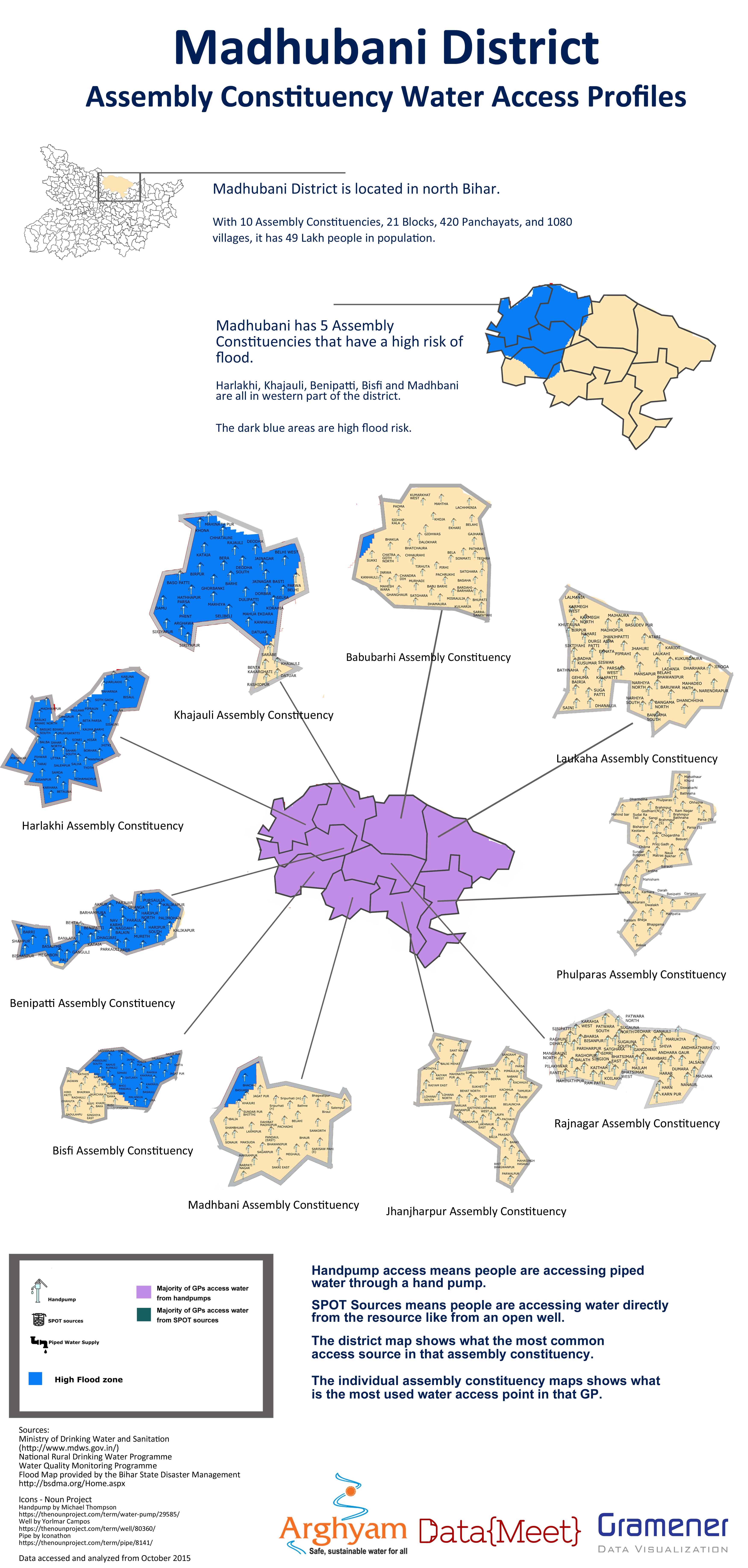
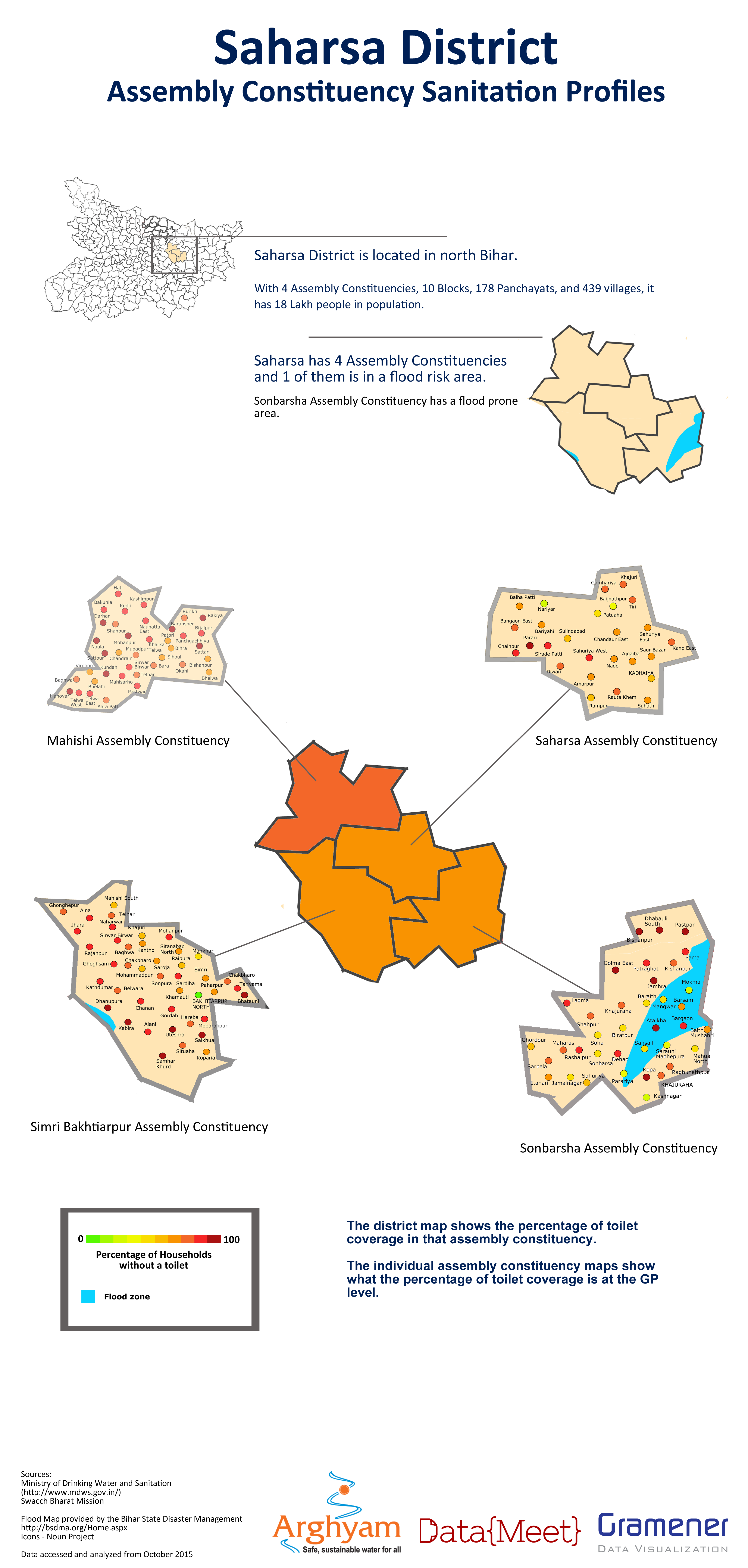
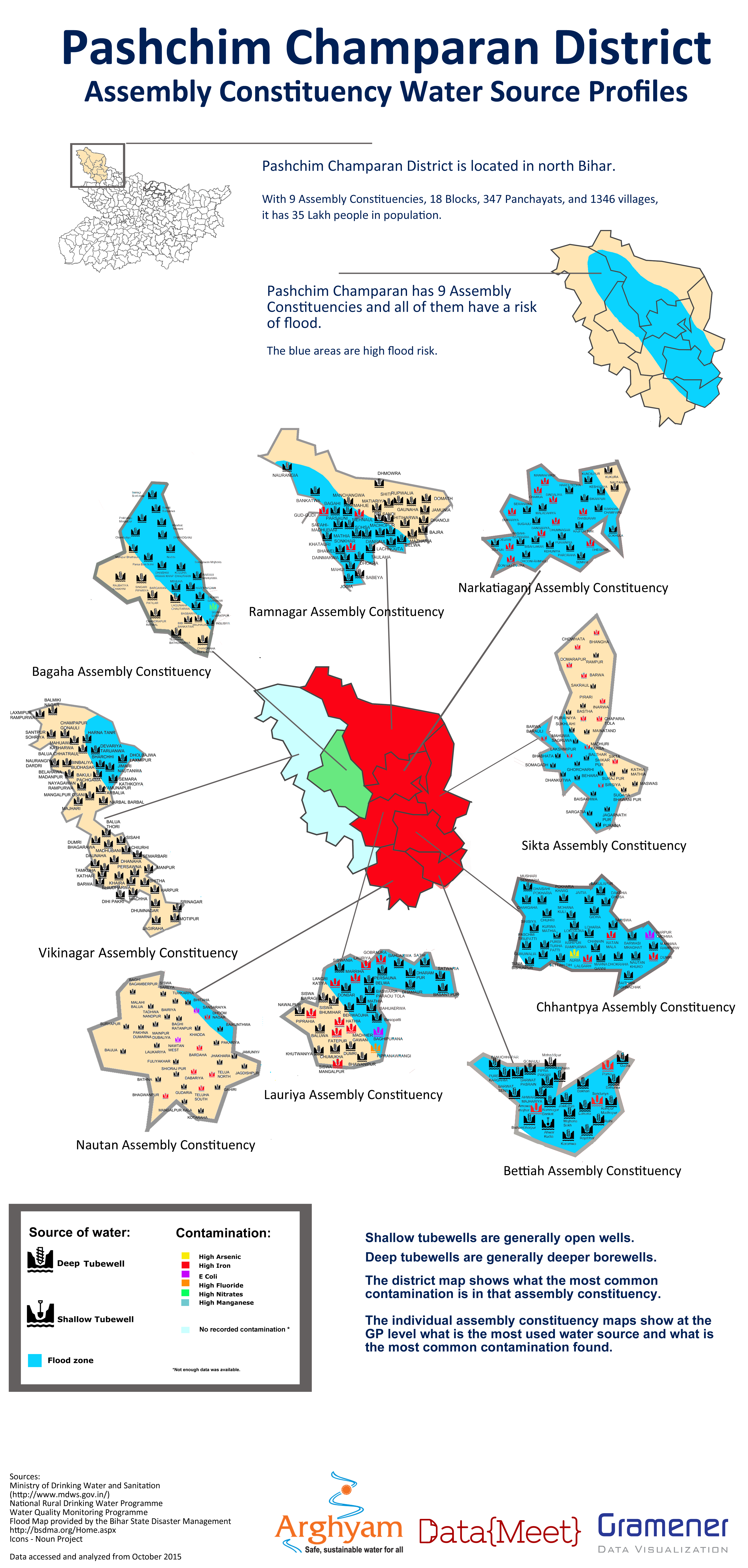
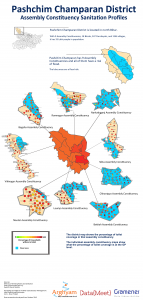
For this first project DataMeet would project manage and Gramener would provde the data analysts, the non profit managing partner was Arghyam and the ground partner was Megh Pyne Abhiyan. Megh Pyne Abhiyan works in several districts in north Bihar on water and sanitation issues. They wanted to use data to tell the story of what the status of water and sanitation was in those districts as a way of engaging with people during the election. It was decided we would do water and sanitation (WATSAN) status report cards for 5 districts — Khagaria, Pashchim Champaran, Madhubani, Saharasa, and Supaul — using government data.

This was an exciting project for us because it would be the first time DataMeet would work with a partner who works on the ground and the output would be for a rural, non online, non-English speaking audience.

DataMeet would project manage the process of data cleanup, analysis and visualization (which the team from Gramener would do) and then give the report cards to the Megh Pyne Abhiyan for them to do the translation and create the final representation of the report cards for their audience.

The Data

The partner wanted the data to be mapped to Assembly Constituencies, they wanted analysis for following situations

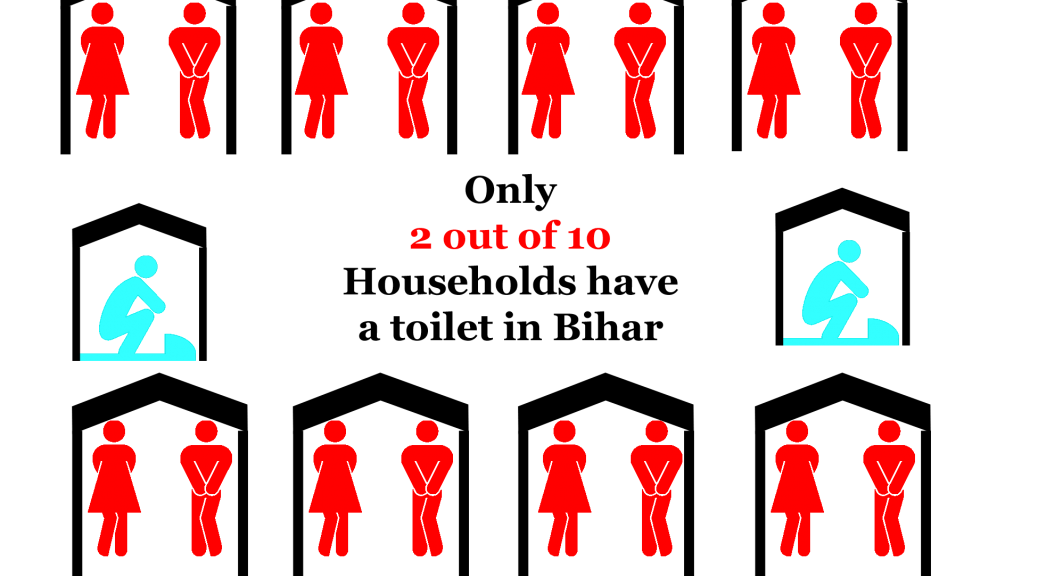
  1. Sanitation coverage for each Assembly Constituency and Gram Panchayat.
  2. Water quality, what is the contamination situation of the district, Assembly Constituency and Gram Panchayat.
  3. Water access, how do people get their drinking water.

It was also important to understand this data in the context of the flood prone areas of Bihar. For instance if there is an area that gets drinking water from shallow wells, with little sanitation in a high flood area those areas can suffer from high levels of water borne diseases.

The data we got was from

Since we were doing report cards based on Assembly Constituencies we needed the data to be at the Gram Panchayat (GP) level. Luckily the MDWS does a good job of collecting data all the way down to habitation so GP level data was available.

There is no official listing of what GPs are in which Assembly Constituency so the partner was asked to split the data by AC so we wouldn’t have to do that mapping. They agreed they knew the area better and would have the resources to pull together all the GP level data into organized Dropbox folders grouped by districts then split into ACs.

Data Cleanup

We received one PDF file per GP,  for water access and number of toilets, water quality was given in one large file by district.

All the data we received was in PDF. This was a huge hurdle as the data was from the government information management system so it was from a digital format but rendered in a PDF this meant that we had to convert unnecessarily. However, since the ground partner picked the data they needed and organized it by AC we wanted to make sure we were using the data they specified as important. So we decided to convert the data. This job was done by Thej and I and was extremely manual and time consuming and caused some delay in the data being sent to the analysts.  (See how we did it here.)

Analysis

The analysis required was basic. They needed to know at an AC level what the sanitation coverage was, the sources of water, how people were accessing it and what the water quality situation is.  Rankings compared to other districts and ACs were done to give context. Rankings compared to other districts and ACs were done to give context.So in all the analysis stage didn’t take much time.

Example of Analysis


Visualization

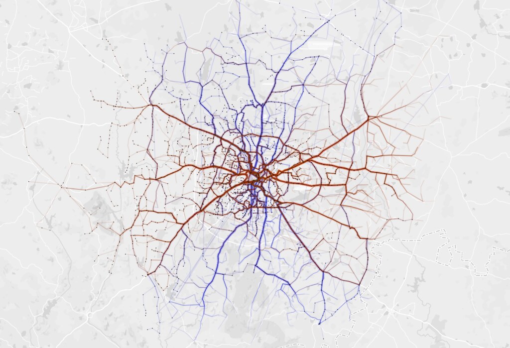
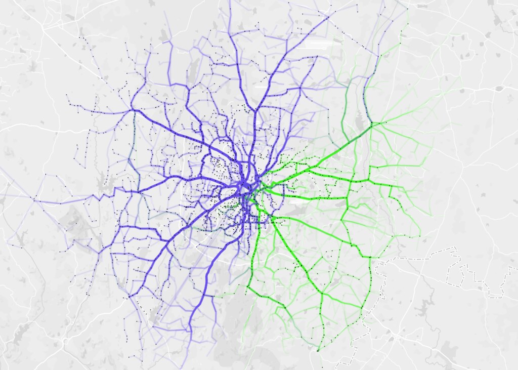
The UNDP along with the Bihar State Disaster Management Authority had created a map of diaster prone areas including flood. It was in PDF so we asked the folks at Mapbox India to help out with creating a shapefile for the flood map so we layer flood areas onto the Assembly Constituencies.

Bihar AC map with flood prone areas


While we had AC maps we didn’t have GP level maps. They didn’t seem to be available and we couldn’t find them in PDF form either.

Since the election is staggered by district we started with Khagaria. After the initial report cards were done the partner wanted just the cleaned up data in tables to use for their meetings. So we then decided to do the report cards, clean up the data and send the spreadsheets over to them.

As we were processing the next 4 districts I found GP level maps of Bihar, with boundaries of ACs included. This was quite exciting and I thought since we had some time we could do maps for the four pending districts.

After receiving the analysis for the next district I decided that since it would take to long to trace the PDF maps, so the analysts could map the GPs, I would just over lay them onto our AC shapefiles in Photoshop. I was going to put icons or circles in the center of the GP and that would be the map. While tedious I figured it would be worth it to show the maps to the ground partner.

However, when I started mapping I realized that analyzed data wasn’t matching up with the GPs on the map. The GPs listed in the Assembly Constituency in our original folders were incorrect, which meant all the analysis was wrong. Everything had to be checked against the maps and reorganized in the final datasets and then reanalyzed. This caused a huge delay.

On top of that the GPs on the map were spelled differently than in the MDWS data, and every dataset potentially had a different spelling of a particular GP. Which meant the remapping of the data had to be done manually looking at the map, the data, other sources, and sometimes guessing if this was the correct GP or not. This ended up being a manual process for every AC, as we didn’t do this mapping and standardization in the beginning.

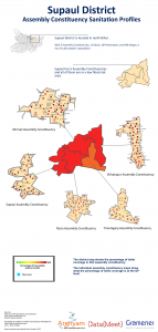
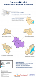
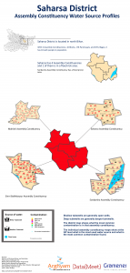
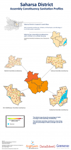
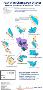
While the delay caused problems with the maps being used in the election, they were worth doing to understand the problems with the data and the ground partner identified with the maps the most. By the end we were able to produced districts posters for the different parameters.
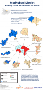
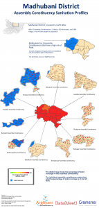
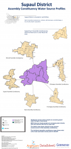
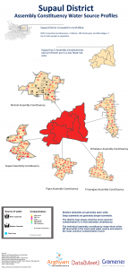
Sample report card


Final Posters

PC_sanitation copy poster madhubani_wateraccess copy poster madhubani_sourceprofileposters madhubani_sanitation poster Supaul_wateraccess copy poster copy Supaul_sourceprofile poster copy Supaul_sanitation copy poster copy Saharsa_wateraccess copy poster copy Saharsa_sourceprofile poster copy Saharsa_sanitation copy poster copy PC_wateraccess copy poster PC_sourceprofile poster


Lessons for next time

We learned a lot from this process. Mainly that the issues with standardization of Indian names in data is a real concern. While initiatives like Data.Gov.In are an important first step, it will take real will and dedication to work out this problem.

NGOs and groups that don’t work with data at the scale of modern data techniques are not always familiar with issues like formats, standardization problems, data interoperability,visualization and mapping to other datasets. This means that more time needs to be spent getting the intentions of the project out of the partner not just outputs. Problems like PDFs are not things everyone thinks about so the extra time of working with the partner to understand what data they want and find way to get it are better spent then converting PDFs to CSV if we don’t have to.

Designers are important, I created and designed the maps and posters, while I’m proud of them, they could have been done better and faster by a trained designer. Designers are worth the money and effort in order to make the final product really reflect the care and work we put into the data.

I consider this experience a success, despite the setbacks, we learned how to manage a team that was not full time and how important the initial work with the ground partners are to create realistic deliverables and timelines.

You can get all the data on DataMeet’s github page. 

Big thanks to the Gramener team – Santhosh, Pratap and Girish for dedicating their free time to this.

Five Years of DataMeet Discussions

We consider 26/01/2011 as DataMeet birthday. Thats the day we talked about starting DataMeet and hence it is the birthday. But the first email to the group was sent by S.Anand on 27/01/2011. Its been five years since that first email. I took this opportunity to scrape the email list to see how we are doing and what we talked about in last five years.

Growth

Activity

Members have started 1525 and have sent in total 4570 emails. But most important is how many participate.
infogram

Category Members
No Emails 855
1 Emails 184
2 Emails 75
3 Emails 43
More than 3 189

Discussions

Go have a look at full view of the traffic graph. Except for few peaks the group has been fairly consistent.

Starters

We have discussed about 1525 in last five years. Here is the list of top 20 starters.

author total topics started
Nisha Thompson 199
Thejesh GN 164
sumandro 71
Sridhar Gutam 64
srinivas kodali 36
Gautam John 30
Sajjad Anwar 28
Pranesh Prakash 27
bawaza…@gmail.com 27
Venkatraman.S. 23
satyaakam 22
S Anand 21
Balaji Subbaraman 20
Nikhil VJ 19
Justin Meyers 15
Sanky 15
Dilip Damle 14
Maya Indira Ganesh 13
Shree 13

First Responders

The first responders are important when someone posts a question. They are the first ones to respond to the questions. As you would have guessed the list is different from the starters list.

author number first response
Devdatta Tengshe 36
Gautam John 36
Nisha Thompson 57
srinivas kodali 28
Thejesh GN 27
Sajjad Anwar 21
satyaakam 20
Arun Ganesh 16
Avinash Celestine 15
Venkatraman.S. 15
Anand Chitipothu 14
sumandro 13
Dilip Damle 10
JohnsonC 10
S Anand 10
Gora Mohanty 9
Meera K 9
Sabarish Karunakar 9
Nikhil VJ 8

Part of many discussions

These are the members who have participated the most.

author total_emails_sent
Nisha Thompson 397
Thejesh GN 297
Gautam John 158
srinivas kodali 128
sumandro 109
Sajjad Anwar 93
Arun Ganesh 88
Dilip Damle 88
Devdatta Tengshe 85
satyaakam 83
Sridhar Gutam 81
Avinash Celestine 73
Justin Meyers 71
S Anand 68
Pranesh Prakash 67
Venkatraman.S. 64
Nikhil VJ 55
Raphael Susewind 55
Anand Chitipothu 51

Topics

We have discussed many many topics over years. But there are some popular topics. I have the list of topics by most replies.

Starter date/time topic
Karthik Shashidhar 2015-05-04 23:00:01 Shapefiles for "complete" India
megha 2014-04-10 14:10:21 MP/MLA Shapes
Srihari Srinivasan 2013-03-06 22:59:44 List of BMTC Bus stops
Nisha Thompson 2014-05-20 23:51:49 Logo Contest Voting!
S Anand 2016-02-01 18:31:38 PIN code geocoding
Siddarth Raman 2014-04-17 16:16:29 Parliamentary Constituency to Assembly Constituency to Ward linkages
Nisha 2013-04-15 09:44:21 April's Bangalore DataMeet
Gautam John 2012-04-14 09:49:50 I Change My City
Arun Ganesh 2011-03-14 11:23:25 Licensing crowdourced data projects
Sharad Lele 2015-11-27 19:59:49 Census of India seems to have maps of everything!

We also get quite a bit of traffic through search engines. So here is the list of top topics by views.

username date_time views topic
Karthik Shashidhar 2015-05-04 23:00:01 12324 Shapefiles for "complete" India
S Anand 2016-02-01 18:31:38 4783 PIN code geocoding
srinivas kodali 2013-07-01 12:49:33 2291 GeoJson data of Indian states
Aashish Gupta 2014-02-24 10:23:12 763 1981 and 1991 district-wise census data
Justin Meyers 2014-07-26 22:05:13 668 Updated Taluk Shapefile!!
indro ray 2013-08-13 10:21:18 651 MCD Delhi Admin Boundary GIS map
My profile photo 2012-08-30 17:41:45 615 Bangalore – BBMP ward boundaries – shape files available now
megha 2014-04-10 14:10:21 556 MP/MLA Shapes
Kavita Arora 2012-09-13 23:32:25 546 Ward Wise data for Bangalore – 2011 census?
Renaud Misslin 2014-12-03 09:45:16 426 Delhi ward shapefile for census 2011 data

At last customary wordcloud of topics.

wordcloud_subjects_arrow2

Of course all the scrapers and data is available on github. Go ahead make your own visualizations.

To Hack or Not to Hack….

Hackathons are a source of confusion and frustration for us. DataMeet actively does not do them unless there is a very specific outcome the community wants like freeing a whole dataset or introducing open data to a new audience. We feel that they cause burn out, are not productive, and in general don’t help create a healthy community of civic tech and open data enthusiasts.

That is not to say we feel others shouldn’t do them, they are very good opportunities to spark discussion and introduce new audiences to problems in the social sector. DataKind and RHOK and numerous others host hackathons or variations of them regularly to stir the pot, bring new people into civic tech and they can be successful starts to long term connections and experiments. A lot of people in the DataMeet community participate and enjoy hackathons.

However, with great data access comes great responsibility. We always want to make sure that even if no output is achieved when a dataset is opened at least no harm should be done.

Last October an open data hackathon, Urban Hack, run by Hacker Earth, NASSCOM, XEROX, IBM and World Resource Institute India wanted to bring out open data and spark innovation in the transport and crime space by making datasets from Bangalore Metropolitan Transport Corporation (BMTC) and the Bangalore City Police available to work with. A DataMeet member (Srinivas Kodali) was participating, he is a huge transport data enthusiast and wanted to take a look at what is being made available.

In the morning shortly after it started I received a call from him that there is a dataset that was made available that seems to be violating privacy and data security. We contacted the organizers and they took it down, later we realized it was quite a sensitive dataset and a few hundred people had already downloaded it. We were also distressed that they had not clarified ownership of data, license of data, and had linked to sources like Open Bangalore  without specifying licensing, which violated the license.

The organizers were quite noted and had been involved with hackathons before so it was a little distressing to see these mistakes being made. We were concerned that the government partners (who had not participated in these types of events before) were also being exposed to poor practices. As smart cities initiatives take over the Indian urban space, we began to realize that this is a mistake that shouldn’t happen again.

Along with Centre for Internet and Society and Random Hacks of Kindness we sent the organizers, Bangalore City Police and BMTC a letter about the breach in protocol. We wanted to make sure everyone was aware of the issues and that measures were taken to not repeat these mistakes.

You can see the letter here:

We are very proud of the DataMeet community and Srinivas for bringing this violation to the attention of the organizers. As people who participate in hackathons and other data events it is imperative that privacy and security are kept in mind at all times. In a space like India where a lot of these concepts are new to institutions, like the Government, it is essential that we are always using opportunities not only to showcase the power of open data but also good practices for protecting privacy and ensuring security.

Guest Post: Varun Goel- Releasing Data for Agriculture

RRAN_logoVarun serves as the chief data scientist at a research team led by Dr. Ashwini Chhatre, serves as the Research Node of the Revitalizing Rainfed Agricultural Network – an India wide network of NGOs, civil society organizations, researchers, policy makers and think-tanks that aim to reconfigure the nature, amount and delivery of public investments for productive and resilient rainfed agriculture. 

The Combined Finance and Revenue Accounts (CFRA) report is an annual report prepared by the office  of the Comptroller and Auditor General (CAG) of India to provides comprehensive Union and State government data on audited receipts, revenue expenditures and capital outlay for different major, minor and sub-minor heads.

Since the figures for actual expenditures on different heads may differ from actual  budget allocation by as much 15 to 20 percent, and that each state might have different procedures of auditing, the CFRA data provides reliable and fairly disaggregated figures of public expenditure, audited by a central authority.

The research team at the Revitalizing Rainfed Agricultural Network (RRAN) has scraped and processed the CFRA data from 2005-06 to 2010-11 for all general and economic services to understand statewide public investments in agriculture and allied activities, and highlight the mismatch in investment and needs on the ground.

The processed data, along with detailed information for each head can be forked here.

Although the data is only available at the state level, it can provide valuable insight on not just public expenditure in other domains such as urban development, health, central and state sponsored schemes, but also highlight the differences in budget allocation and actual spending of various government heads.

Revitalizing Rainfed Agricultural Network (RRAN) has practice and policy node that generates ground based evidence and block, district and state level for policy engagement, the research node’s objective is to generate evidence for testing key hypotheses to enable an articulation of the nature and magnitude of public support needed to fuel growth of India’s rainfed agriculture. To facilitate this, a Data Center has been set up with the aim of acquiring, reconciling, processing, visualizing and disseminating pan India datasets to assist in exploratory analysis and develop research hypothesis, backing up policy advocacy through scientifically rigorous data analysis, and implementing data-driven decision-making tools for program implementation by grass-roots level organizations.

Open Access Week – Open a Dataset with Srinivas Kodali

Cross post from Lost Programmer

Starting today it is International Open Access Week, I have been associated with concepts of open data and open access since 2012 and was hoping to bring some serious attention to it in India. This week I intend to showcase a serious of datasets which several departments of Govt. of India publishes in there web portals through NDSAP apart from Open Government Data Platform

Today’s dataset which I want to bring attention is of Indian Customs. Indian customs maintains records of every product imported and exported through land, sea and air. They publish this data through their commerce portal. They should be highly appreciated for maintaining this website and publishing the data. The data is published as per Notification No. 18/2012-Customs (N.T) dated: 5th Mar, 2012

The data being published includes origin, destination ports, name of the product, Harmonized System code of the product, quantity of product, unit quantity of the product, customs valuation of the product. For imported goods, the origin country is published instead of the port, while for export you get to know the exact destination city.

Read the rest over at Srinivas’s blog here

And if you are using the data for anything please let us know! Stay tuned for tomorrow’s release!

Open Access Week 2015 India Events

It’s Open Access Week! This week there are events around the country to celebrate openness and explore how far we have to go.

MapBox is putting up an amazing Open Data Gallery Tuesday the 20th in Bangalore. Come and hangout look at incredible art and projects from around the country!

In celebration DataMeet is doing its first MULTI CITY EVENT!

Join us Saturday 24th at 6:30pm for talks from Data.Gov.In, Ahmedabad and Bangalore with livestreaming between the cities!

  • Data.Gov.In will talk about the latest updates to Open Data in India.
  • Bangalore will discuss open access in general and open data projects.
  • Ahmedabad will talk about the status of Open Access in their part of the world.
  • Srinivas Kodali will talk about releasing datasets.

Bangalore’s event will be at Centre for Internet and Society.

Ahmedabad will be at CEPT University. 

Please RSVP on Facebook or Meetup.

Let’s celebrate all we have been able to accomplish as a community and look forward to continuing to promote a culture of openness, sharing, learning and collaboration.


{Ahmedabad} – 2nd Meetup

Data{Meet} Ahmedabad – 2nd Meetup

Data{Meet} Ahmedabad - 2nd Meeting

Data{Meet} Ahmedabad – 2nd Meeting

Our 2nd meetup was held at IIM-A, under the aegis of the RTE Resource Centre, with 20 participants; half of them had attended the 1st meetup.

Talk #1: All walls come down – by Ashish Ranjan, RTE Resource Centre, IIM-A

The first talk in the 2nd DataMeet of Ahmedabad Chapter brought forward the efforts being put together by the team RTE, working out of IIM-Ahmedabad. The team members present at the venue were Prof. Ankur Sarin, Ashish Ranjan, Advaita R and Nishank Varshney. Ashish presented their journey of supporting the implementation of RTE in the state of Gujarat.

The Right to Education (RTE) act Section 12 requires schools to enrol a certain number of children from economically weaker families. The RTE Resource Centre (rterc.in) organises pre-enrolment campaigns for the benefit of prospective students and their parents, and has enlisted NGOs for hand-holding the children post-enrolment. The talk gave a glimpse of their experience in Ahmedabad, observations from Maharashtra, and the data-related challenges they faced.

datameet2

The management of this important activity was being done manually. This threw up many problems:
The registration of beneficiary families was often incomplete, with partial addresses – recording just the area of residence e.g. “Jamalpur”. This lead to many parents complaining about non-receipt of allotment letters..
There was no mapping of schools or beneficiary families, which could have aided better matching of children and schools.

A study by the team RTE revealed how a large number of schools were finding their way around the RTE mandate. These methods include making demands of un-required documentation of the parents to, tricking the MIS systems which enable applications from parents, into counting the ages of the children eligible for the schools as ineligible amongst various others. Nishank pitched in with instances from Maharashtra, where the minimum and maximum permissible age limits were deliberately entered by schools in such a way that potential students would be under age during an admission year, and over age the next year, effectively excluding them. In some particularly bad cases, the difference was one day: the child would have to be born on a specific date. For lack of efficient and transparent allotment processes, there were cases of candidates getting multiple admissions (as much as 18) while some did not get any. To bring out all these analyses, though, the school and student data from the Maharashtra RTE website had to be painstakingly downloaded, manually. Many DMers offered support to gather this data more easily.

datameet3

The team was quite inspired by the school map of the Karnataka Learning Partnership (klp.org.in/map) and wants to build such a comprehensive tool for themselves, with features to find schools within a specified distance, and help match students with schools. Unlike the Karnataka programme, there still is no MIS in place to facilitate the enrolment and selection process. Shravan suggested that it might be possible to use the codebase of KLP and adapt it for use in Ahmedabad. Hopefully, the D{M} folks will volunteer for the necessary support.

The RTE team also wants to build a tool to track the performance of enrolled students. They discussed about the potential privacy issues involved in this. It was suggested that the performance reporting to be published on the website could be at an appropriate level of aggregation which safeguards privacy and preserves discernible performance stats. The possibility of using ODK for volunteer led data collection was also discussed.
Getting together at the meetup opened up many possibilities for collaboration from the participants as a few of them came forward with suggestions and also extended their support to this cause.

Talk #2: Public Transport of Ahmedabad

Jayesh Gohel is not your everyday architect. He dropped out of his course at CEPT because he got too interested in code and soon enough he started enjoying making websites. Being an Amdavadi, he noticed the lack of infrastructure, both digital and non-digital in supporting the commuting that AMTS enabled in the city and so he decided to work on amtsinfo.in – the unofficial official support and information website for the Ahmedabad Municipal Transport Service.

Jaye

At the 2nd Datameet in Ahmedabad, Jayesh inspired the audience with his experiences with developing the website with the sole aim of solving the information problem related to the rather important and convenient network that AMTS is. Jayesh’s talk was simple and spoke about his personal motivations and learnings in the course of the development of this app. It also brought to the light the issues that plague the archaic systems that govern our modern lives, which can otherwise be so easily solved with the use of digital technology. However, ‘there’s hope if all of us take initiatives’, Jayesh said.